A web form, also written webform, is an area on a web page where visitors type in information and send it to the site owner. It can be as small as a single email field for a newsletter or as large as a multi-page application with file uploads. In both cases it does the same job as a paper form: you ask, the person fills in the answer, and the result lands on your desk. Only here it arrives by email, in a spreadsheet or in a CRM.
If you have ever left a message on a “Contact us” page, ordered something online, booked a time slot or taken a quiz, you have used a web form. For a business site it is usually the main way to turn a visitor into a request, so it is worth knowing what a form is made of and how it works.
What forms a website usually needs are a contact form for a question, an order form for a purchase, a booking form for a time slot, a survey or a quiz for answers, and a calculator for a price. Each of these is a web form. The difference is which fields you ask for.
Example: a simple web form.
What a web form consists of
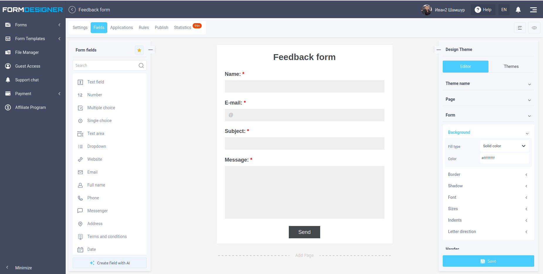
Every web form is built from fields, and which fields you choose depends on what you need to learn from the visitor. A text field takes a short answer such as a name, an email address or a phone number. When the answer can run longer, say a question or a review, you use a text area, which scrolls and accepts as many lines as the visitor wants to write.
For choosing from ready options there are three tools that are easy to confuse. Checkboxes let the visitor tick several items at once, for example extra services, and each box is simply on or off. Radio buttons work the other way around: the visitor picks exactly one option, such as a delivery method, and selecting a new one clears the previous choice. A drop-down list does the same job as radio buttons but takes far less space, so it suits long lists like countries or cities. It can also be set up to allow several selections.
Forms can accept files too, so a candidate can attach a resume or a customer can upload a photo. Date and phone fields take values only in the right format. And at the end there is the button that sends everything to the server. It can say “Send”, “Order” or anything else, and some forms use a picture instead of a standard button.
How a web form works
When the visitor presses the button, the form first checks what has been typed. Validation rules catch the obvious mistakes before anything is sent: a required field left empty, a phone number with letters in it, an email address without the @ sign. You can set these rules for every field, along with its label, a hint and the default option in a list.
If everything is in order, the data goes to the form handler. This is a script on the server, or a service that does the job for you, and it decides what happens next: save the answers, send them to you by email, pass them to a CRM or add a row to a spreadsheet. The visitor, meanwhile, sees a thank-you page or is redirected to another address. In a poll or a vote the page shows the current results.
A web form in HTML
In HTML a web form is wrapped in the <form> tag. It has two main attributes: action says where the data is sent, and method says how. Inside the tag you place the fields (<input>, <textarea>, <select>), a label for each of them and a submit button. Here is the smallest working example:
<form action="/send" method="post">
  <label for="email">Email</label>
  <input type="email" id="email" name="email" required>
  <label for="message">Message</label>
  <textarea id="message" name="message"></textarea>
  <button type="submit">Send</button>
</form>
There are two methods for sending the data. With GET the data is added to the page address, so anyone can see it in the address bar and in the browser history. With POST it travels in the body of the request. That is why GET suits search and filters, and every form with personal data should use POST.
| Method | Where the data goes | What it suits |
|---|---|---|
| GET | Into the page address | Search, filters |
| POST | Into the body of the request | Requests, orders, registration |
You do not have to write this by hand. A form builder generates the code for you and also takes care of the part that is not visible in the example: the handler that receives the data on the server.
Why use web forms
A web form gives you the same set of answers from every visitor. A free-form email may miss the phone number, the date or the budget, and you have to write back to ask. A form with required fields collects all of it in one go, in a structure you can sort, search and export.
Forms also work around the clock. A visitor can book, order or leave a request at night, and the answer lands in your inbox or CRM without anyone typing it in again. Fewer typos, less manual work and fewer lost requests are the main reasons businesses put a form on every key page.
Where web forms are used
The most familiar example is the feedback form, where visitors ask a question or report a problem. Close to it are the application form for requests and the order form, which can also take payment. If you work with appointments, a booking form lets people choose a time slot and pay a deposit, and a subscription form collects emails for a newsletter.
Forms are not limited to collecting contacts. A voting form and a test form show results to the person who answered, a quiz qualifies the leads that come from ads, and an online calculator shows the total before the visitor sends anything.
Web form design best practices
A good form looks simple, even when it asks a lot. Put the label next to or above each field so it stays visible while the visitor types, and add a hint for the format where it matters, for example a phone number with the country code. Keep the form in a single column: it is easier to scan and looks the same on a phone.
Make the fields and buttons big enough to tap with a thumb, and group related questions together, starting with the easy ones. Check answers as the visitor types, so a mistake is highlighted next to the field and the message says what to fix, not just “Invalid input”. Do not forget accessibility: connect each label to its field, make sure the form works with the keyboard and keep the text contrast readable.
The most common mistake: a form that asks too much
The mistake we see most often is a long form with a pile of required fields. A visitor who came to leave a simple request sees fifteen questions marked with red asterisks, estimates how long it will take and closes the tab. Every extra question gives the person one more reason to leave, and conversion drops with it.
Ask only what you need to respond to the request. For a callback that is a name and a phone number, for a quote it may be a few parameters, and everything else can wait for the first conversation. Before adding a field, ask yourself what you will do with the answer, and if the honest answer is “nothing”, remove it. Mark a field as required only when you cannot move forward without it, and leave the rest optional.
Sometimes a long form is unavoidable: a job application, a detailed survey, a registration for an event. In that case split it into several pages with a few related questions on each, so the visitor sees a short step instead of a wall of fields and knows how far along they are. Another option is the mode where the form shows one question at a time, as in a chat or a quiz. It feels lighter, keeps attention on a single answer and works well on phones. FormDesigner supports both approaches: forms with several pages and the one-question-at-a-time mode.
Security and spam protection
Any open form attracts spam bots and the occasional attack, so protection is part of the form, not an extra. Always check the data on the server as well as in the browser: validation in the browser makes the form more pleasant to use, but a determined user can bypass it. Send the form over HTTPS so the data cannot be read on the way, and use the POST method for anything personal.
Against spam, a CAPTCHA works but irritates visitors, so many sites start with a hidden “trap” field that real people never see and bots fill in, and add a CAPTCHA only if the spam continues. Limiting how often one address can submit the form also helps. In FormDesigner you can protect a form with an invisible, a math or a Google reCAPTCHA captcha, a password and limits on repeat submissions, and forms work over HTTPS; see the security features.
Privacy and data protection
Ask only for the data you really need, and tell visitors what you will do with it: a short note with a link to your privacy policy next to the button is usually enough. If the form is used for marketing emails, add a consent checkbox and leave it unticked by default. Rules differ by country, so check the requirements that apply to your business.
When the data is especially sensitive, for example medical or HR details, you can go further and encrypt the answers. In FormDesigner you can encrypt form data: the responses are stored encrypted and can be read only with your private key.
Integrations
A form rarely lives on its own. The answers can go to email, Telegram, a spreadsheet or a CRM, and a form with a payment step can take money straight away. It is also worth connecting form submissions to your analytics, so you can see how many people open the form and how many finish it. If most visitors leave in the middle, the form is too long or one of the questions puts them off.
How to create a web form
Writing a form by hand means writing the HTML, then a script on the server to receive the data, then a database or mail setup to store it, and then keeping all of that working. It is a lot for something most sites need in the first week. An online form designer like FormDesigner takes the server side off your hands. You add the fields and validation rules, say where the answers should go, then copy the ready code and paste it into the page. It works on any site and CMS, and later changes are made in your account without touching the code.
If you do not want to start from a blank page, start from Free forms or read how to create a capture form in 3 minutes.