Efficient web form design: structure, input fields, labels and actions
Everyone who uses your apps or website does so for a specific purpose. And very often one such purpose is data entry. Web forms have been, are and will continue to be one of the most important interactions between users and the application or website. Most often, a web form is the final step in getting what you want, and it makes sense that it should be simple and clear to everyone.
In this article we will talk about practical usability methods, which were obtained as a result of long tests, field trials, studies of eye movement and analysis of user complaints. When properly applied, this information will help many developers create input forms much faster, easier and more efficient than they have done before. This article is basically a guide to creating your own prototypes, and to work you just need to download Adobe XD for free and get started right away. In addition, at the end of the article you will discover some new methods for creating html forms.
Form Components
Usually the form creation consists of five components:
- Structure. This includes the order of the fields, their appearance on the page in the form, and the logical relationship between the input fields.
- Input fields (inputs. They include text fields, password fields, check boxes, switches and any other way to enter the information you need.
- The labels of the fields (labels. Indicates what you need to enter into the fields.
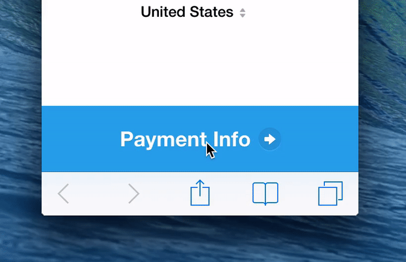
- Button of action. By pressing this button, some action takes place - for example, data are sent to the server.
- Feedback. The user wants to know if he has entered the information correctly and this is done using feedback. Most often it is a simple text message, notifying of a positive result ("Registration is complete!") or a negative result ("Your entered number is incorrect").
In addition, the forms may include the following elements:
- Tips. Help the user to understand exactly what to enter into the form.
- Validation. Automatic verification will ensure that the data entered by the user is correct.
In this article, we will look at many aspects related to form structure, input fields, labels, confirmation buttons and validation.
Form structure
The form is one of the types of communication. And, like any conversation, it must be a logical connection between a user and the application or site being used.
Request only the information you need
Make sure that you ask the user for really important information. The more input fields, the worse conversion rate, so always consider why you need this or that information and what it will be used for.
Structure the form logically
Request information logically from the user's point of view, not from the site or database. For example, it would be unusual to ask a user's address first and then his name.
Grouping related information
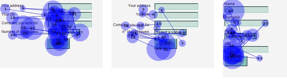
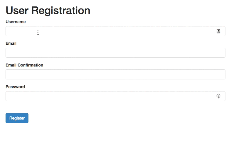
Group the information related to each other logically into separate blocks. This will make it easier to understand what will need to be entered in a single block, and accelerate the "dialogue" between the user and the system. Take a look at how this works, using the contact information form below as an example.
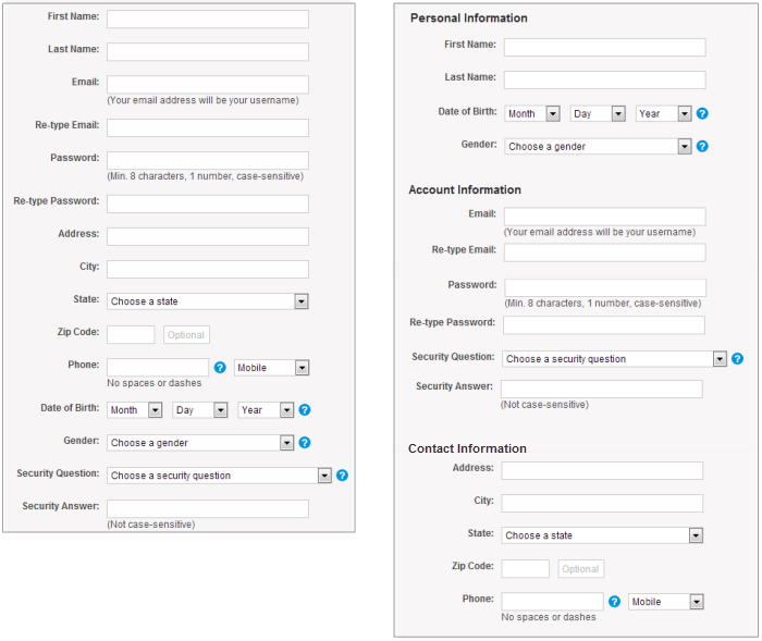
Group the logically linked fields
One column or several?
One of the problems encountered when creating a form in multiple columns is that users misinterpret the sequence of information input. If there are adjacent fields in several columns in the form, the user has to work hard, revise the form, which will slow it down and reduce the probability of successful completion. But if the form is built in one column, in a straight line downwards, it will be much easier for the user to input the necessary information.
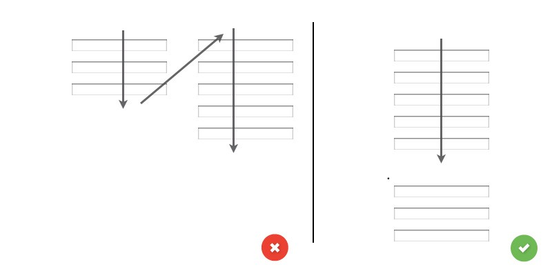
The example above on the left shows one of many ways to misinterpret a form from two columns, while on the right the form looks logical and easy to fill.
Input Fields
Text input fields are used to fill in the form by users. There are different types of fields for collecting information - these are text fields, password fields, drop-down lists, checkboxes, switches, file downloads and much more.
Number of fields
The main rule in creating forms is that the shorter the better. This makes the form less complex to fill, more intuitive and increases conversion. Therefore, it is worth minimizing the number of fields, which will make the form less loaded - but do not forget that you can not overbend the stick, especially if you need to get a lot of information. No one likes a form of three fields to suddenly turn into 30 lines to fill. But 5 fields, "growing" in 7, is a common practice today.
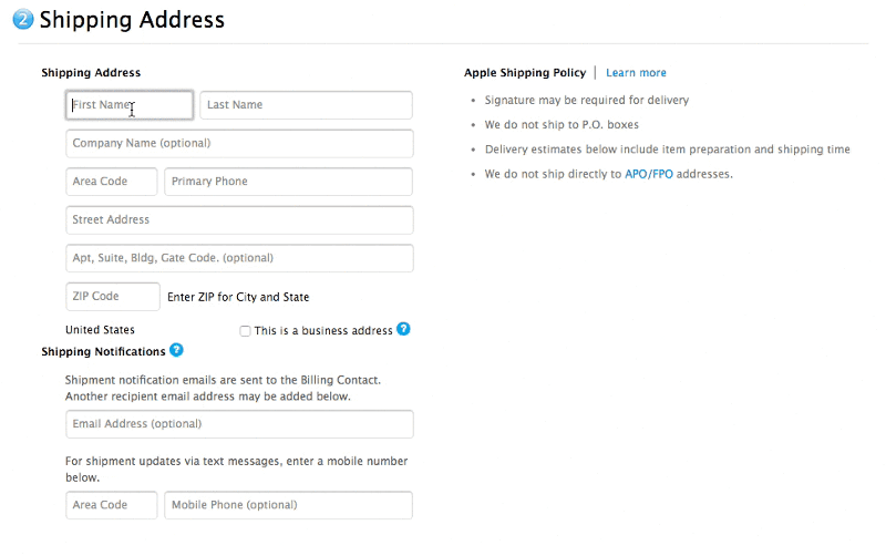
Combine several fields into one to make filling more convenient
Mandatory and optional fields
Additional fields in the forms is an inconvenience that should be avoided. But if you have to use them, you should make it clear to the user which fields to fill in and which to leave empty. It is very easy to do - a banal asterisk (*) in the label for the required field or the word "optional" in the optional field (especially useful in long forms with several important fields). By the way, if you use an asterisk as a pointer to the required field, don't forget to put an explanation at the bottom of the form for what the "*" sign means, as not everyone understands what it is for.
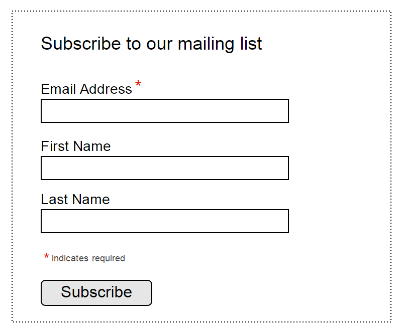
MailChimp subscription form MailChimp
Default value of the field
It is desirable to avoid the default values, if it is possible that not all users (less than 90%) will choose this particular value. This especially applies to the required fields. Why? Because it is likely to lead to unnecessary filling errors. Usually users fill out online forms very quickly, not really knowing what and where to choose, and often miss out on what may matter.
But this does not apply to "smart" defaults - values that are set based on already available information about the user. "Smart" default values allow you to fill in the form faster and more accurately. For example, you can set the user country selection based on geolocation data. Still, you should be careful with default values - many users leave fields as they were originally filled in.
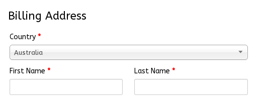
Pre-selected country in order form
Input Masks
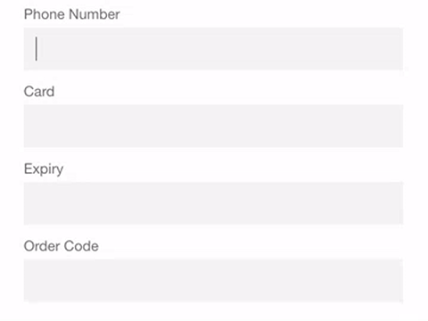
The Input Field Maskis a convenient method for formatting input text. The mask appears when the user puts the cursor in the input field, and it allows for automatic formatting of input text, helping the user to focus on the data being entered and to notice a possible error more easily. In the example below, parentheses, spaces, and dashes are placed automatically when a phone number or credit card number is entered, allowing you to enter the necessary information faster and more accurately than by manually placing punctuation marks.
For computers only: easy form orientation with keyboard
Users should only be able to fill out the form using their keyboard. Many users have experience using keyboard features, so using the Tab button, moving between fields, etc. should be easy and convenient without a mouse. Detailed instructions on how to use input fields with the keyboard are available in the W3C instructions.
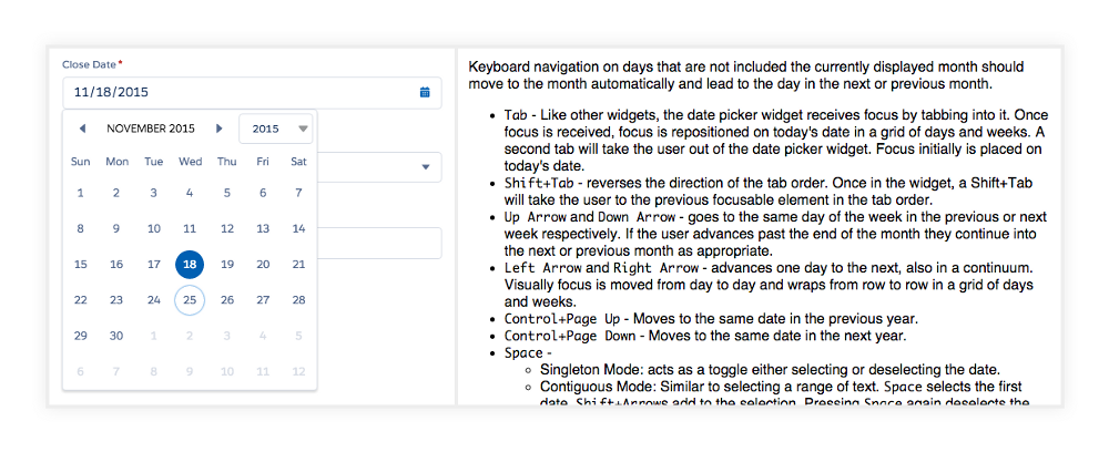
Even a simple date selection must meet W3Cstandards
For computers only: autofocus on input field
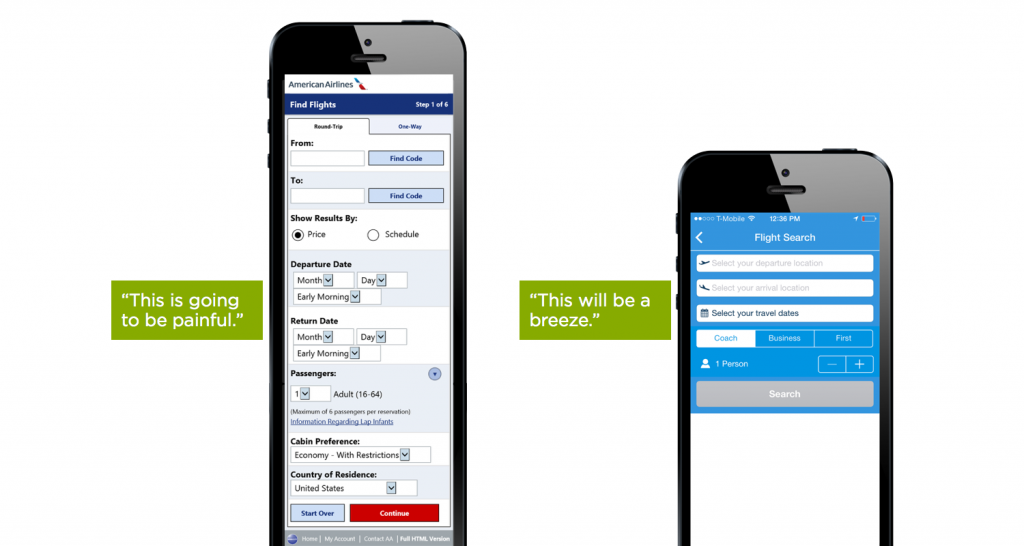
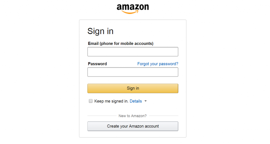
The autofocus field shows the user a starting point for filling in the form, which allows him to instantly start entering information without the necessary searches. A clear visual focus signal is also necessary - changes in the color of the field, blinking of the cursor, etc. here to help. For example, there is a conveniently made Amazon form with autofocus and visual signals.
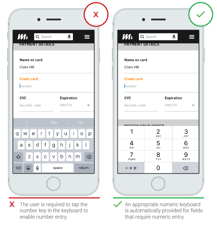
For phones only: automatic keyboard selection for input field
Mobile users appreciate applications that use field-compatible keyboard types (for example, a numeric keypad will open in the credit card input field). This can be implemented not only at the registration stage, but in all aspects of the application.
Decrease the number of sets (autocompletion))
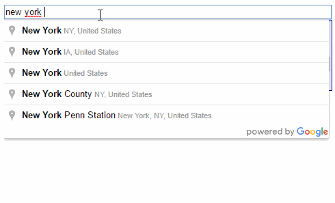
This item is especially relevant for mobile users, because it is most important for them to reduce the typing, make the form more understandable and reduce the number of errors. Auto-fill will prevent a huge number of keystrokes. For example, in many forms, entering an address is a complex part of adding data, and the Address Form tool, which appears during the data entry into the address field and prompts the user on the database and geolocation of the most likely address, allows users to fill out a form with fewer keystrokes.
Tags (labels
Text labels to input fields make the interface clearer and more accessible. Qualitatively executed labels tell the user the purpose of the field before, during, and after the user has entered the desired data.
Number of words
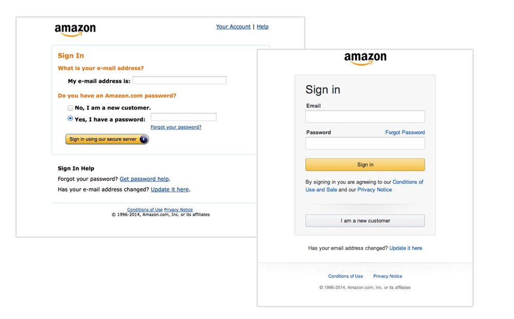
Important - labels are not a reference. It is better that they consist of one or two words, so that users can fill out the form more quickly. A vivid example is the previous version of the Amazon registration form, which was overloaded with unnecessary information and filled in much slower than the current version with short labels.
Capitalization or offer?
Most digital products today have two ways to highlight headlines:
- Capitalization: write each word with capital letters like "This Text Field".
- How to sentence: Write only the first word like "This Text Field" from the capital letters.
Writing labels as a sentence is much more convenient than capitalization: it is easier and faster to read. For short labels there is no difference between "Full Name" and "Full Name", but long labels are better written as a normal sentence. Now you know that the capitalized title is harder to read.
Avoid the "caption"
Never use only uppercase letters if you don't want to reduce the readability of the form and the filling speed - it is inconvenient to analyze the form if there is no difference in height of symbols.
All letters of labels are in upper case, which is very inconvenient for reading.
Label position: left, right or top?
Matteo Penzo in his 2006 article on tagging suggests placing tags on top of the field, as this increases the speed at which the form can be filled at times.
Alignment of label text at the left and right edges, and the label at the top of the field
The main advantage of such placement of tags is the possibility to change the size of the tag in case of translation of the interface, which allows using different localizations with minimal losses (which is especially important for mobile versions).
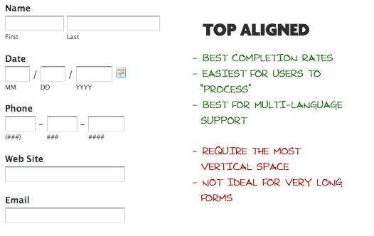
The main disadvantage of the text on the left side of the tag is the lowest speed of filling the form. This is most likely due to the distance between the input field and the tag's text, because the shorter the tag, the farther it is from the field. But don't forget that low filling speed is not always a bad thing - for example, it is better to "slow down" the user by entering sensitive data. Let's say you're asking for a driver license number or social security - and since the accuracy of the data you enter is important here, you can slow down the user a little. And another disadvantage is that the tag on the left side requires more horizontal space, to which mobile users are particularly sensitive.
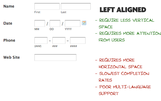
A big plus of the label text on the right edge is an excellent visual connection between the label and the input field. Components placed side by side are connected with each other - and this was obviously quite a long time ago, as it follows from the law of proximity in Gestalt psychology. Thus, short forms with the text of labels at the right edge are filled in much faster. However, such forms are slightly more uncomfortable to read - they do not have a rigidly fixed left edge, which is less convenient for the eye.
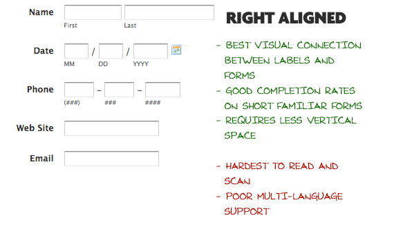
Conclusion: if you care about the speed of viewing and filling the form, place the marks above the fields, as it speeds up the movement of your eyes down. But if you need to be careful when entering data, it is better to place a tag to the left of the input field, which will force the user to read the information on the Z-trajectory and more carefully to fill out the form.
Built-in Tags (as a placeholder-а)
A tag used as a (placeholder) in an input field disappears when the cursor is placed in the field; the user stops seeing the tag. But this is only useful for the simplest forms, while longer forms require more information from a tag to get information from the user.

By moving the cursor to the input field, the user stops seeing the label - and it is inconvenient to check the correctness of the text entered, which increases the chances of error. Another problem is the possibility that the user will confuse the filler with plain text and ignore the need to fill in the field (studies by Nielsen Norman Group only confirm this).
Text placeholder as field label
A good solution for template text is the floating mark. It's very simple - the text is used as a field filler, but as soon as the cursor appears in the input field, the filler disappears and appears as a label on top of the field.
Conclusion: You should not rely solely on field fillers, because they will disappear when you enter information - and this will complicate the verification of the correctness of user input. Use a floating-tag, which will make it much easier to check.
Primary and secondary action buttons
Lack of visual differences between the buttons of primary and secondary importance can easily lead to a form reset. Therefore, the less visual similarity, for example, between the "Confirm" and "Cancel" buttons, the more likely it is that the user will finish filling without problems.
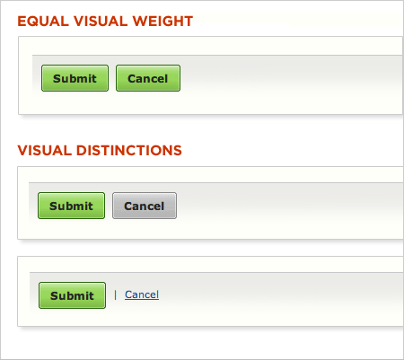
Equal visual "weight", and the difference between the buttons "Confirm" and "Cancel".
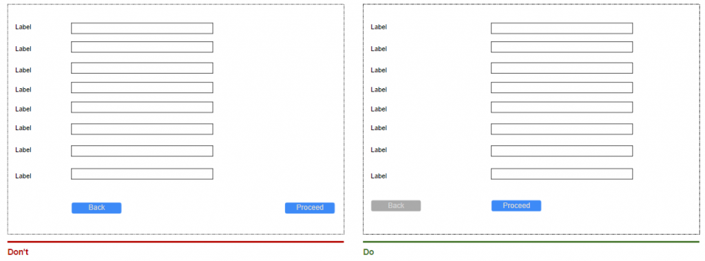
Button Location
As a rule, the "Back" button is required in complex forms. But if you place it directly under the input field, the user can easily confuse it with the confirmation button and press it. Since the "Back" button is a secondary action button, it is worth to make it less accessible, for example, to place it under the marks and reduce visual similarity with the buttons of primary importance.
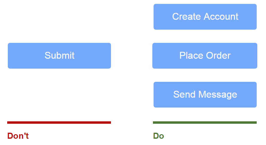
Correct name
Avoid general words like "Send" for buttons of primary importance, because they do not make it clear what will happen when you send data. It's much better to describe a specific action when you click on it instead - for example, "Create account" or "Subscribe to weekly news".
A few action buttons
The more buttons, the more confusion you have, so avoid using more than one.
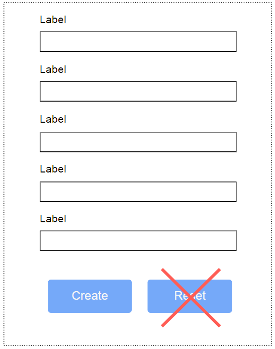
Reset button is evil.
Never use the reset button. It almost never helps users, and moreover it makes them a little nervous. It's therefore much better if you just don't have a reset button.
Appearance
Make the buttons really buttons - show that you can press or touch them.
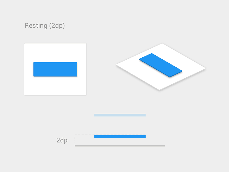
Shading shows that you can press the button
Visual feedback
Develop the "Send" button so that after clicking it clearly shows the processing of data entered by the user. This will allow the user to be sure that he has done everything correctly.
Валидация
Errors in data entry are inevitable and are an integral part of filling in the form (we all make mistakes sometimes). Yes, you can do anything to prevent errors, but they are and will be anyway. So, the main question is how to make a check with minimal difficulties for the user?
Checking online
Users do not like it when they need to fill out the form completely to find out that an error has been made somewhere. It is especially frustrating when you click "Send" after filling out a long form and get a message with the description of errors. It's even more frustrating when you don't specify which field and why there is an error.
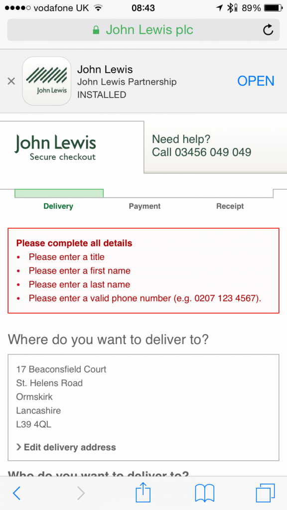
The correct check informs the user about the correctness or error of input immediately upon the fact of entering the necessary information. The main principle of correct checking is a dialog with the user. Tell him what is wrong, point out the errors immediately. Real-time checking allows you to instantly point out to the user the faults, and this approach will eliminate the error much faster, instead of filling in everything, click "Send" and see the report on the incorrectly entered data.
But it is not necessary to overdo it and enter the check for each button press, because in most cases it is simply impossible to check the incomplete information. Therefore, validating the form during input will only confuse the user.
At the same time, it is bad when the form reports errors in filling, but does not remove the message when correcting errors.
Verification in the Apple Store is performed after data entry
In his article "Inline Validation in Forms: Designing the Experience", Mil Conjevik looks at the different variations of the validation and proposes a hybrid strategy that satisfies both sides and sounds like "Reward at once, punish later".
- If the user enters data in a field where valid data have previously been entered, then check after entering it.
- If the user fills in a field that has previously been filled in with invalid information, it is worth checking immediately at the time of input.
Hybrid strategy: "Reward at once, punish later".
Data protection
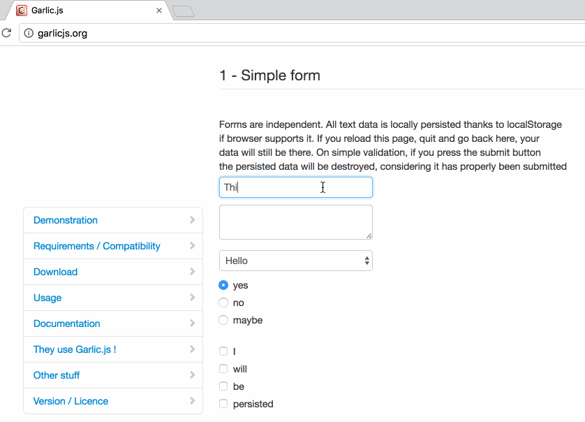
Jeff Ruskin once said: "The system must consider all data entered by the user as sacred. For forms, this is especially true - just imagine how good it is when you fill out a form, accidentally refresh a page, and the data remains in place. Tools such as Garlik.js can help, which helps you save the values of one of the forms before submitting the data. This way users don't waste time and data even if they accidentally close their browser.
Dialog interfaces - new way to fill in forms
Recently, conversational interfaces and chat bots are gaining popularity. Many trends contribute to this phenomenon, but one of the strongest is that people spend a lot of time in messaging programs, and even more than in social networks. This is the result of a large number of experiments in many areas, such as online stores, where the form was filled as a conversation - as in an ordinary messenger. Even web forms have changed under the influence of this trend - many designers are trying to turn an ordinary form into a convenient dialog interface.
Really conversational interface
Each interface is like a normal conversation. Yes, the forms we create are very similar to a normal conversation, but these questions look a bit machine. But what if we put a little humanity into the conversation with the user, show a real attitude, not a machine one? This way, it would be much easier for the user to communicate with the application as a human being rather than a machine. For example, it is possible to make a form as a normal sentence with context conditions rather than bothering the user with data entry.
This form from Codrops uses a dialog pattern to be more natural
Conversational Form
Conversational Form is an open source concept that turns any form on a web page into an interactive conversation. It replaces all input elements, takes reusable variables from previous questions and fully simulates a real conversation. It's just a project under development so far, but it's already interesting with its new look at the interaction between users and the form - it's as if you're communicating in a regular chat, but you're achieving your goal in the form of ordering, searching for information, etc.
Conclusion
Users do not always like to fill out forms, so make this process as easy as possible. Just minor changes, such as grouping fields and the logical relationship between them, or automatic filling of a number of fields based on hints, can significantly improve the convenience and ease of use. And don't forget about usability tests - just a few people or a colleague can give a lot of interesting hints to create a really handy input form.
--
Source: blogs.adobe.com