Checklist: designing and optimizing a feedback form on the site
Feedback forms help partially automate the collection of requests and contact data from the site. But it is important to properly design the form so that it helps increase the number of conversions on the site. The specialists of digital-agency Direct Line prepared a checklist where they analyze the most important elements of feedback forms point by point.
Feedback form on a website can do multiple things:
- Accepting online applications
- Testing, voting, and collecting other statistics
- Prompting people to sign up for the mailing list
A beautiful, but functional form can more effectively solve its tasks. So let's look at the main points to pay attention to when optimizing it.
Number of fields
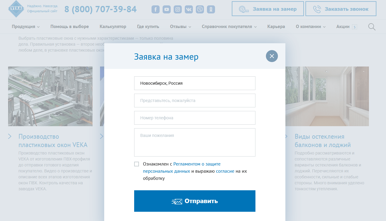
Frequently you see extended types of forms on sites where you are prompted to fill out three or more fields before submitting a request. This requires extra concentration from the user and they may end up leaving the site.
Statistics say that if the form contains more than 3 fields, the likelihood that the user will leave the page without leaving contact information is extremely high. This won't happen if you have a unique and valuable offer, but in most cases the visitor won't be willing to sacrifice their time and go through the process of filling out a form like that.
So the main goal is to make the process as easy as possible by reducing the number of fields in the form to a minimum, leaving only the target ones.
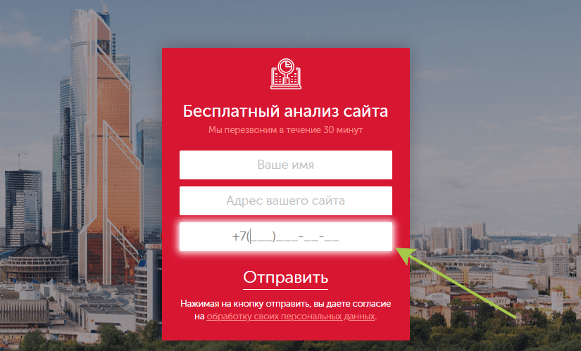
Field type and autofill
Each field can be qualified by type, e.g. text, numeric, and these in turn into phone, email, etc.
It is recommended to prompt the user what they are supposed to enter in a specific field, for example, if it is a phone number field, implement a partial autofill country code.
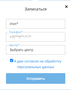
Also in the example you can see that in addition to the mask for entering a phone number, the form contains the names of the fields. This will make sending personal and other data as easy as possible.
Saving the entered data
Implement a cache feature that allows you to save and display previously entered form data, even after the page is refreshed. This will help when the user has filled out the form and the internet connection is broken, or some other reason that causes the page to be refreshed.
Afterwards, the visitor will usually need to fill out the form again, but this can lead to potentially lost customers. However, if the data is saved, then the user will continue to fill it out from where it failed.
Avoid automatically popup forms
Automatically pop-up forms act as annoyances, and getting an effective tool for communicating with users with them is unlikely. No matter what stage such form appeared: either while loading the page or while reading it, you are more likely to get a negative response from your visitors, rather than their location and willingness to leave their contact information.
So avoid pushing to fill out a form this way.
Adaptation for mobile devices
Mobile traffic should not be ignored in the complex promotion of the site, because its part can be up to 50% and more.
The same applies to feedback forms, when designing them, don't forget to prepare a version for mobile devices. For example, the action button (usually sending data) often goes to the second screen, which requires scrolling through the page. This point may not always be obvious to the user, and not seeing the button, there may be a feeling of form loading error. Because of this it is best to put it in the first screen area.
The same goes for tooltips inside form fields, which are often longer than the screen width and get cut off. The solution is simple: make the fonts smaller but still readable, or add line breaks.
When the user presses the action button, it's important to let the user know that sending of data has started. This is handled by displaying a lowader splash screen which can show e.g. what the download percentage is. Otherwise, if you don't see any notification that it's happening, the user can click the action button again or they can leave the site before it's fully downloaded.
Select a form design color
It is important that the feedback form blends in with the overall design of the site. It is logical to use the same colors, fonts, etc.

But you should pay attention to the color scheme, it should not be too light, because it can make it difficult for people with poor eyesight to fill it. Especially such points should be considered if the target audience of the site - the older generation.
Don't use captcha
Captcha was originally developed to fight spam bots and abusers. At one stage of the development of sites and feedback forms, there were a lot of automated programs to send spam and fill out feedback forms. This forced owners to embed captchas as a protection mechanism.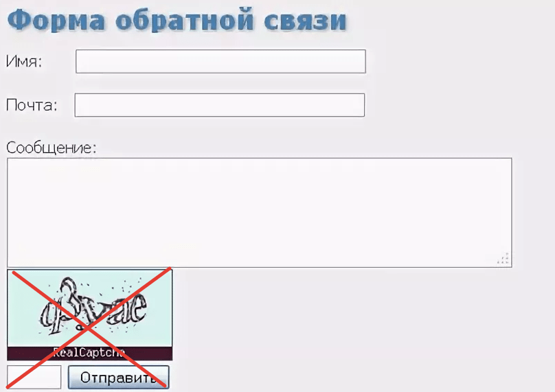
Yes, captcha can help protect against spam, but it will also negatively affect the targeted users, most of whom will not fill out such a form. So, do not use the standard captcha, and if the situation requires it, better install reCaptcha V3 from Google, which is able to distinguish the human from the bot in the background.
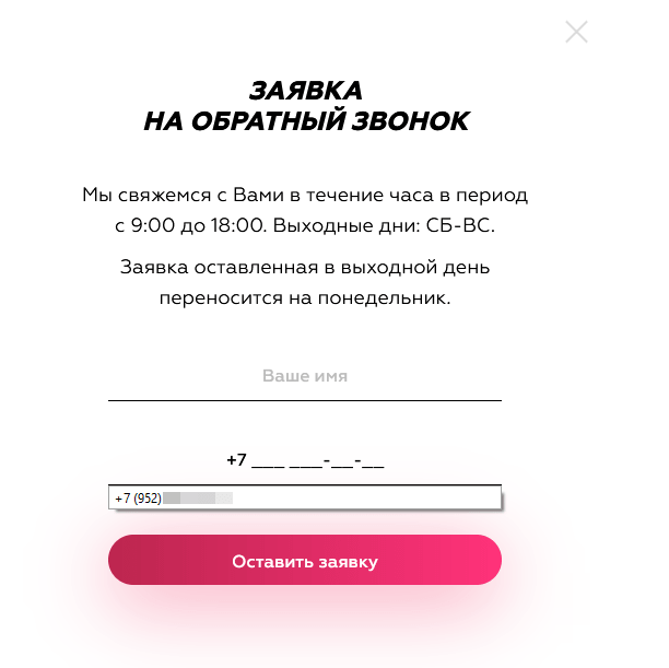
Auto-notification after submission
Some sites have forms where nothing happens after you click the action button. In this situation, the user does not understand whether the form worked or not. So make sure you have a "thank you screen" ready to go as soon as you send the data.
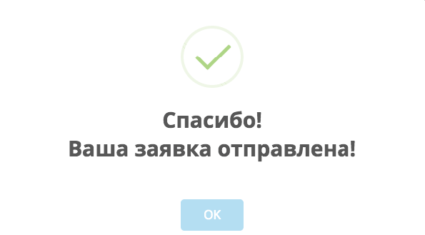
Also include additional information, such as the fact that the company experts will contact the user at a certain time.
Positioning the form on the first screen
If we talk about displaying the site on desktops, we noticed the following effect. Users usually begin to explore the page from the upper left part. Therefore, if you place the feedback form also on the left side, there may be a situation where the user does not have time to review the main offer of the site.
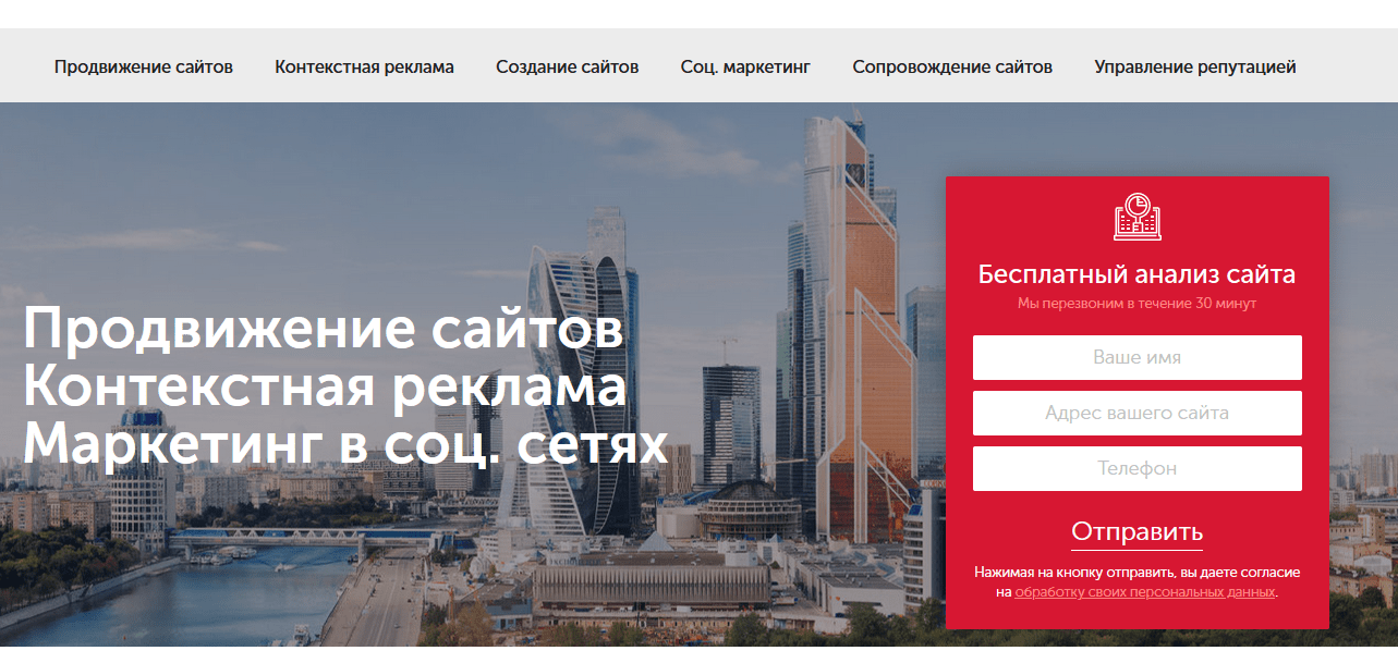
In other words, our goal is to optimize the process of getting personal data from the visitor, and it makes sense to introduce the main offer of the page and then offer the form. This is why the form should be on the right side of the page, on the first screen.
Location of the fields to be filled
When the visitor has selected a field to fill out, it should stand out from the rest, for example, you can increase the contrast of the font and stroke. This allows the user to focus their attention without having to think about which field is being filled.
Autofill fields
Autocomplete is implemented mostly for the phone number field. If the company focuses, for example, only on the Russian market, you can automatically fill in "+7" and begin entering the prefix as "9xx".
It would not be unreasonable to make spaces that match the structure of the number.
Each of the above tips will allow you to create a feedback form that will greatly increase the effectiveness of collecting user data.