Case from the freight transportation site
The story of how I started using FormDesigner . Case on the topic of freight transportation.
1. How I found FormDesigner
Hi all! I will introduce myself under the pseudonym Avtodostavka. I work in the field of freight transportation in Ukraine. We have our own website: avtodostavka.com.ua. In this case I will share my experience of working with a Form designer. I needed an application collection form that would be embedded in a website page using code. Before this, I had not heard of ready-made solutions on this topic. I turned to the search engine and found the site Formdesigner.ru in the organic results.
It became interesting what this solution is, what its cost is and what difficulties there may be with its implementation on the site.
2. Implementation on the site
Registered on the site. I started to understand the interface. I found out about the tariffs . I chose the Basic+ tariff. I immediately created a form using a convenient editor. The form only had two fields: your name and your phone number with a small green "Submit" button that I placed under those two fields. Through the “Get code” section, I copied the script code and pasted it onto each page of my website. So I created my form to receive applications. I got ready to process the applications.
3. Result of implementation
Since my site receives little traffic, I wasn't expecting a surge in applications. But as it turns out, with the same number of visits, I can get twice as many leads. I started studying Internet marketing and realized that the form needed to be made more attractive: make the button brighter, the font in the button larger, change the data entry fields, and also make the form itself in the same style as the site. A year passed before I made changes.
4. Small change - great results
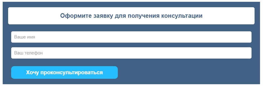
Unfortunately, I can’t show the case in the “what was then” format, because... There is no screenshot of the old form. But I'll show you the new form. But I can say that I made the button more noticeable in size, increased the font of the button, changed the color of the button (it began to stand out more), rounded the edges (the old one had sharp corners) and changed the text on the button (the text was “Submit”). Essentially, the form title and text have now become buttons linked. This is an additional plus. But in the old one, if I’m not mistaken, the name and text of the button did not correlate with each other, and the button itself was smaller, the text was less capacious. This greatly affected the fillability of the form. I also slightly rounded the edges at the margins.
In the form, I left a hint inside the field . This serves as some instructions on what data needs to be entered into the fields. When you hover over the form field, the inscription disappears.
This is what the form looked like after the change:
Link to one of my pages with the form: https://www.avtodostavka.com.ua
And what was my surprise! Significantly more applications began to arrive. If earlier I received 3-5 applications per month, now I receive up to 18 applications. Yes, my traffic has grown over the year, but not in proportion to the number of applications received. That is, the form began to work much better and bring me potential clients.
5. I decided to make a cost calculator using FormDesigner
I want to share my experience of creating a calculator . I needed to implement a shipping cost calculator on some pages of the site. Based on this, I wanted to get more leads and improve the behavioral performance of the site. I wanted the calculators on each page to be different from each other, since there are differences in services. This flexibility was provided by the Form Designer. I set up a separate calculator for each page, which covered its needs.
This is an example of a general calculator that is suitable for calculating the cost of any of the transportation services:
https://www.avtodostavka.com.ua/kalkulyator-gruzoperevozok-ukraina
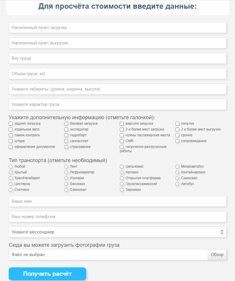
I made an unobtrusive light gray background and thought through the fields and data that need to be taken into account in order to calculate the cost of transportation as accurately as possible. I used the same button design as in the form for receiving applications. I made the following fields mandatory: name and phone number. This must be done, since the user may forget to enter his contact. And so, if he did not fill out the data fields and submits the form, then the following error is displayed to him:

I didn’t know in advance what kind of transportation a site visitor needed, and that’s why the cost calculator turned out to be so voluminous. Everything is thought out, there is nothing superfluous in it. I understand that not everyone wants to delve so deeply and fill in so many fields, but I did not set out to make a simple calculator with a minimum of data. This is an example of a general calculator on a website that is not specific to a specific service.
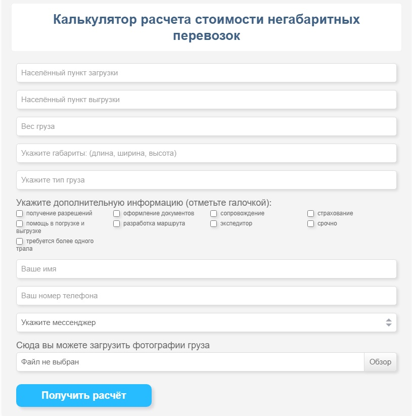
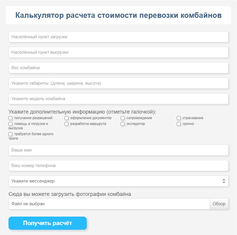
I also made calculators on separate pages where it would be appropriate to place it on. These calculators are much simpler and less voluminous, but still provide comprehensive information on transportation. Design, button did not change. I only changed the number and names of fields. Here are some examples:
Example No. 1 : https://www.avtodostavka.com.ua/dop_yslygi/negabaritnye-perevozki
Example No. 2 : https://www.avtodostavka.com.ua/dop_yslygi/perevozka-kombajnov
Link to one of my pages with the form: https://www.avtodostavka.com.ua
And what was my surprise! Significantly more applications began to arrive. If earlier I received 3-5 applications per month, now I receive up to 18 applications. Yes, my traffic has grown over the year, but not in proportion to the number of applications received. That is, the form began to work much better and bring me potential clients.
5. I decided to make a cost calculator using FormDesigner
I want to share my experience of creating a calculator . I needed to implement a shipping cost calculator on some pages of the site. Based on this, I wanted to get more leads and improve the behavioral performance of the site. I wanted the calculators on each page to be different from each other, since there are differences in services. This flexibility was provided by the Form Designer. I set up a separate calculator for each page, which covered its needs.
This is an example of a general calculator that is suitable for calculating the cost of any of the transportation services:
https://www.avtodostavka.com.ua/kalkulyator-gruzoperevozok-ukraina
I made an unobtrusive light gray background and thought through the fields and data that need to be taken into account in order to calculate the cost of transportation as accurately as possible. I used the same button design as in the form for receiving applications. I made the following fields mandatory: name and phone number. This must be done, since the user may forget to enter his contact. And so, if he did not fill out the data fields and submits the form, then the following error is displayed to him:
I didn’t know in advance what kind of transportation a site visitor needed, and that’s why the cost calculator turned out to be so voluminous. Everything is thought out, there is nothing superfluous in it. I understand that not everyone wants to delve so deeply and fill in so many fields, but I did not set out to make a simple calculator with a minimum of data. This is an example of a general calculator on a website that is not specific to a specific service.
I also made calculators on separate pages where it would be appropriate to place it on. These calculators are much simpler and less voluminous, but still provide comprehensive information on transportation. Design, button did not change. I only changed the number and names of fields. Here are some examples:
Example No. 1 : https://www.avtodostavka.com.ua/dop_yslygi/negabaritnye-perevozki
Example No. 2 : https://www.avtodostavka.com.ua/dop_yslygi/perevozka-kombajnov
6. I’m thinking of using the services of the FormDesigner service in the future.
I’ve been working with the guys for a little less than a year and a half and plan to continue working. I'm not going to switch to another service, because... Everything is fine here. This online constructor has ample opportunities, using and testing which you can increase the conversion of the site, get more leads with the same number of visits that you have now. Reasonable prices, super functionality, excellent support! I wish the team success, successful development of the service, new loyal and regular customers!
The case was designed by the creator of the site: www.avtodostavka.com.ua .