To enter the theme editing mode, you first need to copy the theme (described here - "How to change the design theme?" ). Next, select the "Elements" item. The following settings are available for the form:
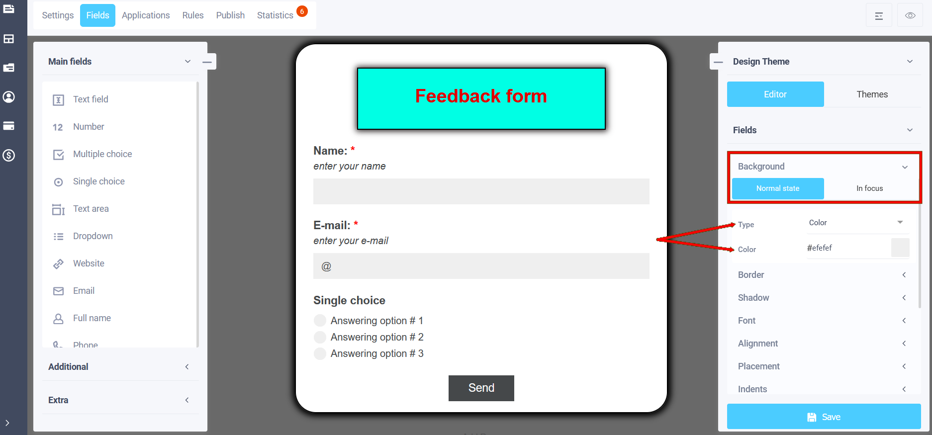
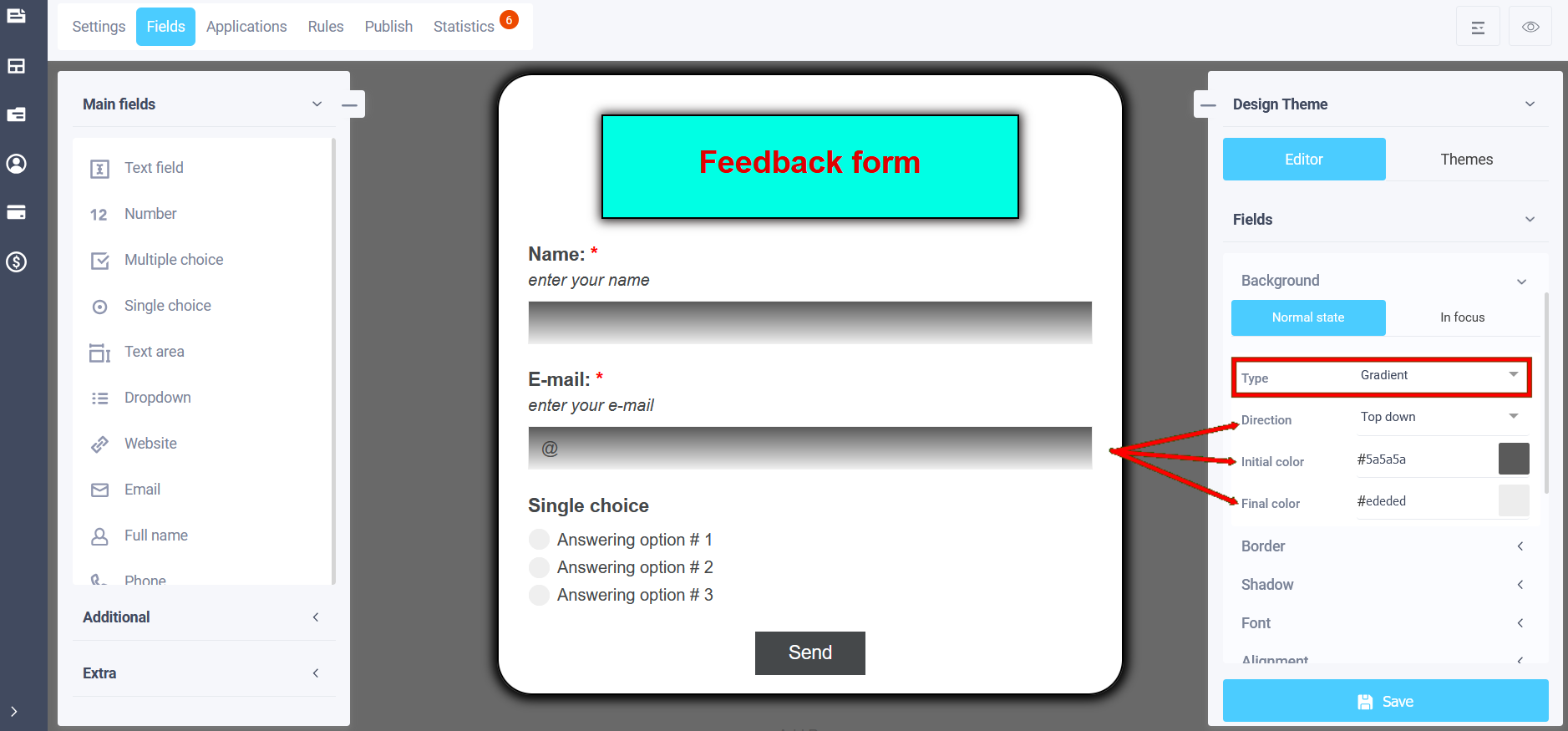
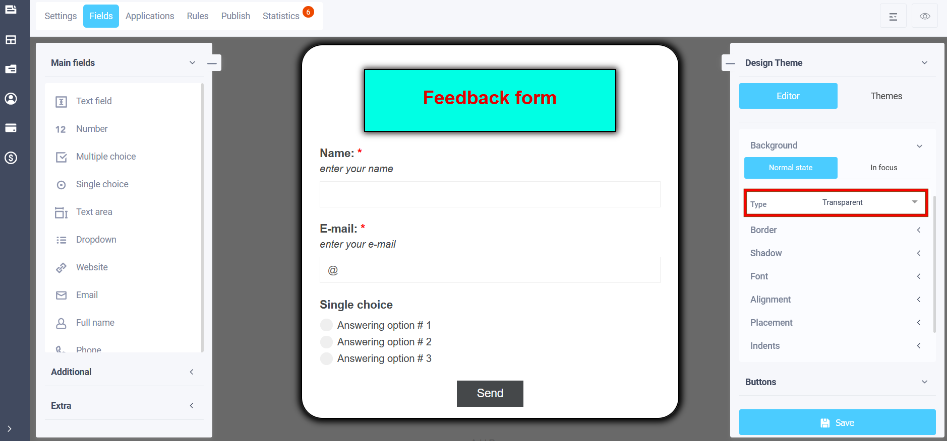
Background
In the "Background" menu you can select a suitable background option for form elements:
- Color
- Gradient
- Image
- Transparent
If you select the "Color" item in the main state, a solid color background of the element will be set, a suitable color can be selected from the palette.
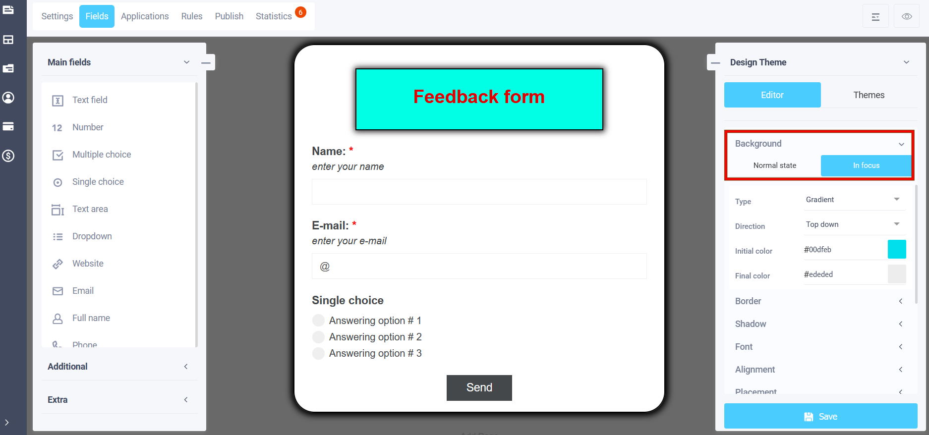
In the "Gradient" section, you can select the initial background color of the element, which will transition to the final color, its selection is also available. You can also set the direction of the color transition:
- Top down
- Bottom up
- From left to right
- From right to left
- From top left to bottom right
- From bottom left to top right
- From top right to bottom left
- From bottom right to top left
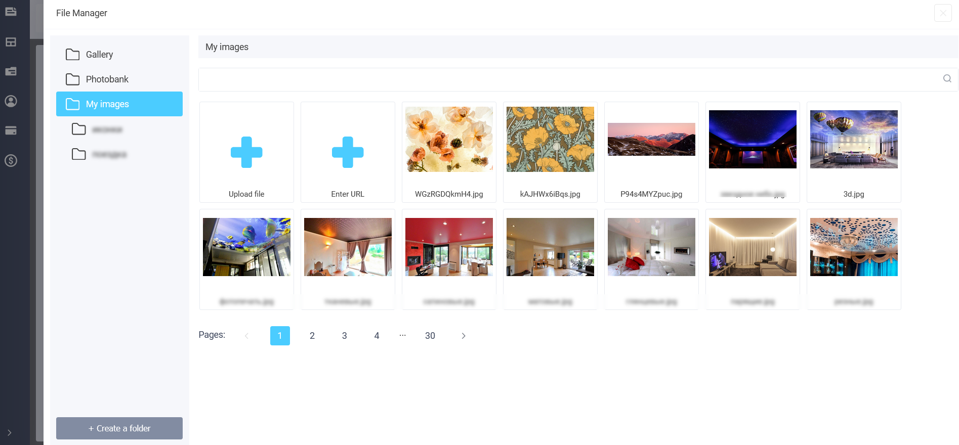
The next item is "Image". To add an image to the page, click on the "Select image" icon in the "Image URL" field and a pop-up file manager window will open with options for selecting an image:
- Gallery
- Photobank
- My images
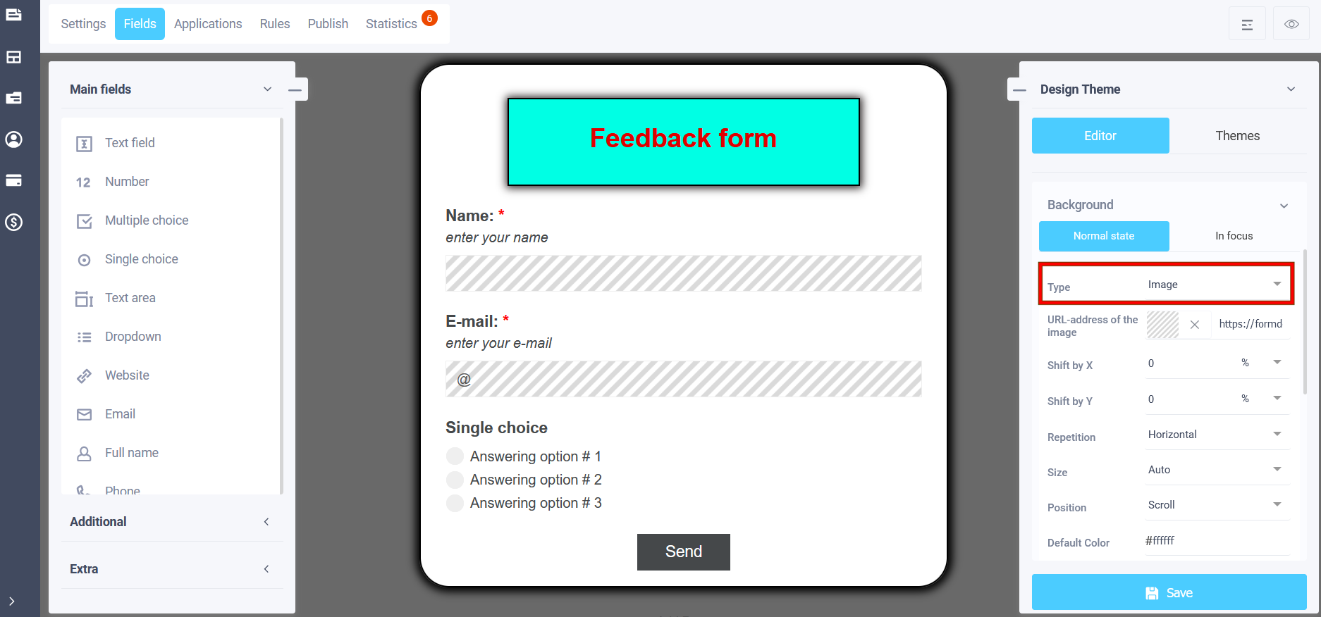
In the "Gallery" section - standard images and in the "My images" section you will have access to previously uploaded images and you can add new images.
In the "Repeat" field, you can set how the image will be located in the element: no repetition, horizontal, vertical, multiply. If you select a transparent background, then the background color of the form will be:
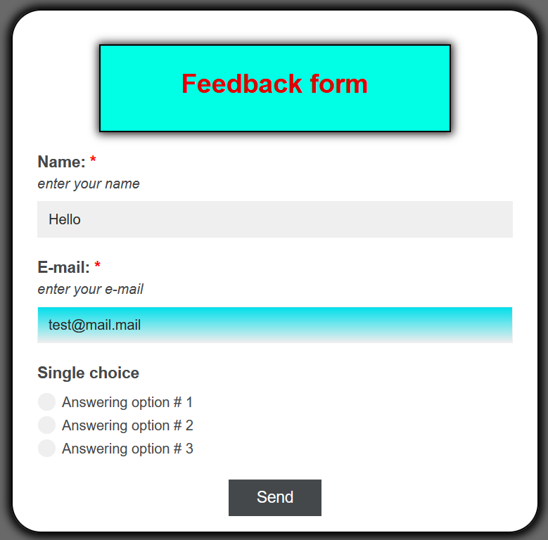
There is also a setting "In focus", i.e. the background of the element, when the user enters data, the background of the element will change to the specified one. The settings are similar to the normal state:
And when entering data, the background color of the element will be as we chose above:
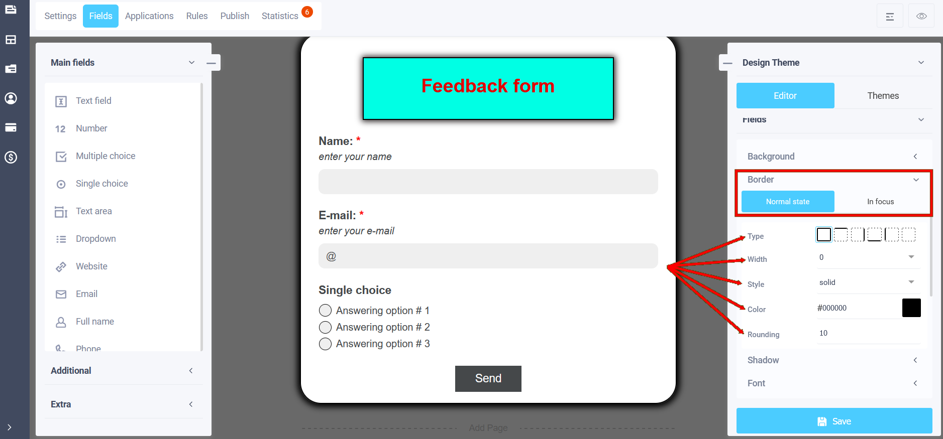
Border
In the theme editing menu, using the "Border" item in the main state, you can set:
- Border type
- Border width
- Border style
- Border color
- Border rounding
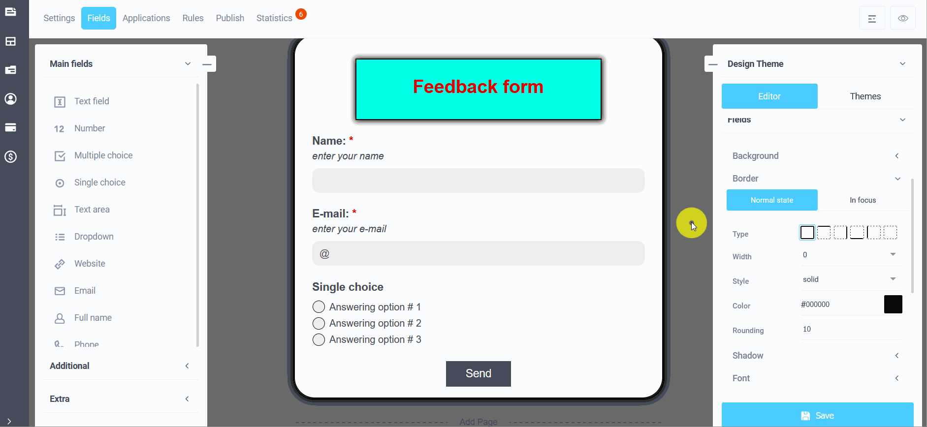
To enter the border settings, click on the slider to enable the option and select the sub-item for configuration:
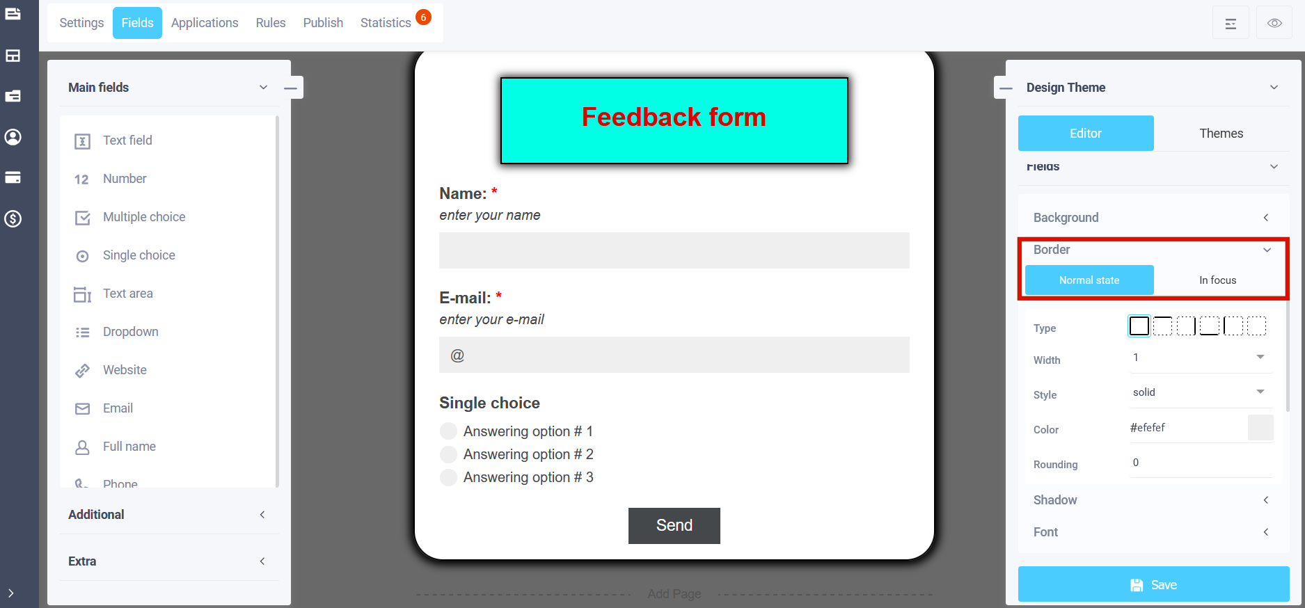
In the normal state, i.e. the appearance of the element frame before entering data:
And in focus, you can also set similar parameters for the frame background, which will be visible at the time of data entry:
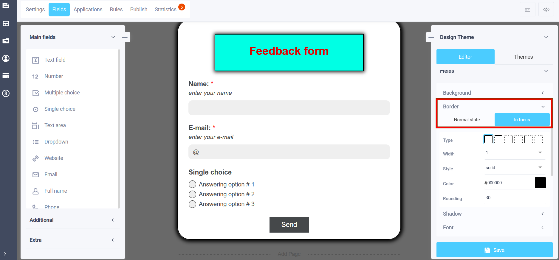
In focus, for example, we chose a black color with a width of 1px:
Since we left the width at 0 in the normal state, and after entering the data (in focus), we chose a black color with a width of 1px, the appearance of the element frame will look like this:
Shadow
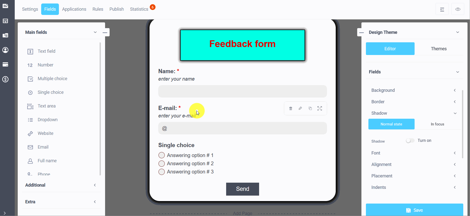
In the menu for editing your design theme, you can customize the shadow of the form by enabling the "Shadow" sub-item by moving the slider:
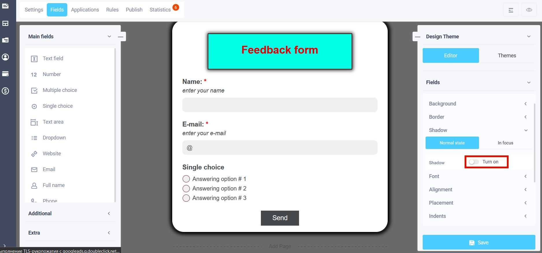
The shadow settings will include the following settings: shadow type (inner and outer), shadow blur, shadow stretch, transparency, and shifts along the X and Y axes:
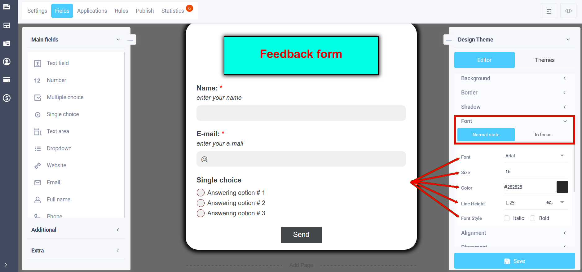
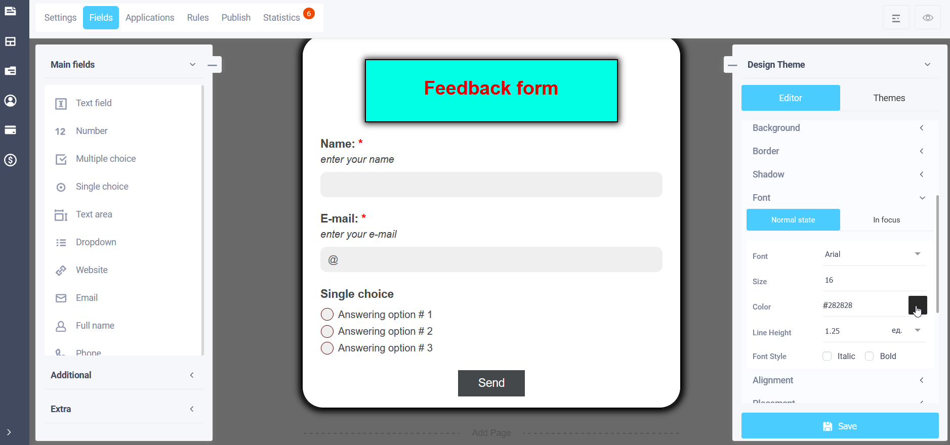
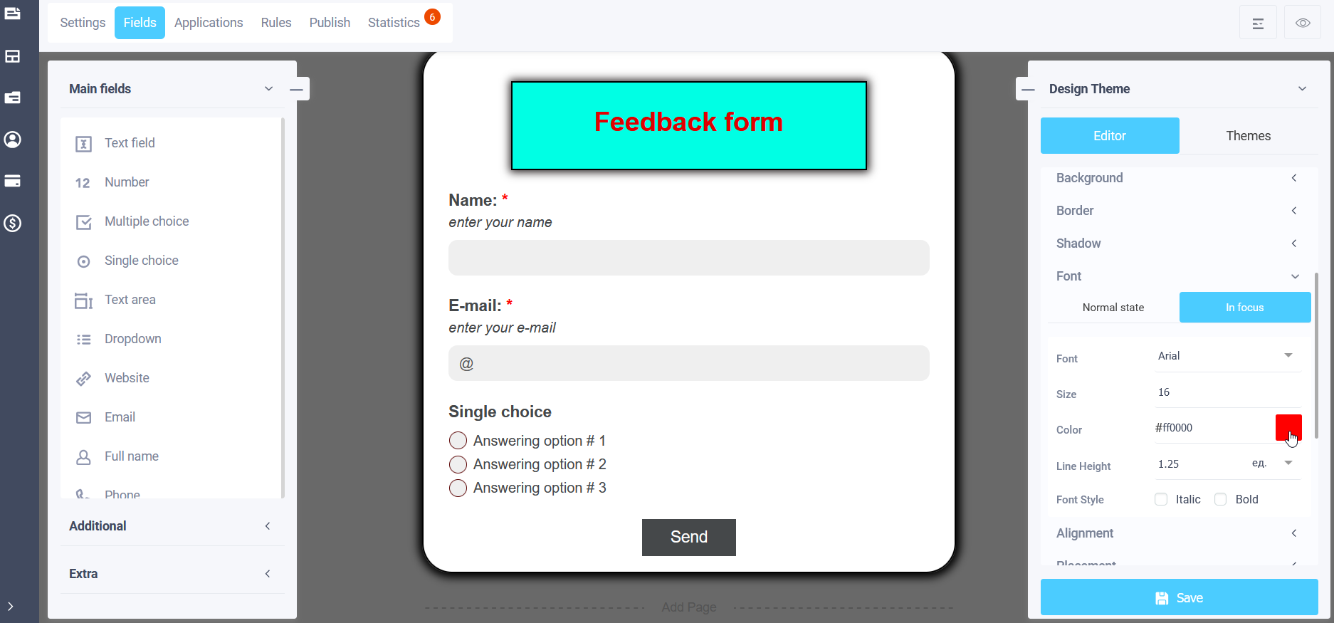
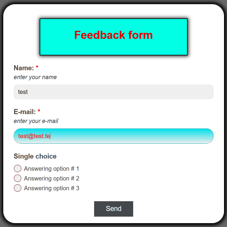
Font
In the theme editing menu, in the "Font" section, the following subsections are available in the normal state and in focus:
- Font (you can choose the font type)
- Size
- Color
- Line Height
- Font style (italic or bold)
In the "Color" field you can select the font color by clicking on the icon on the right and choosing a color from the palette:
Similar to "In Focus":
Alignment
In the "Alignment" subsection, you can adjust the position of element names:
- In the center
- Left aligned
- Right aligned
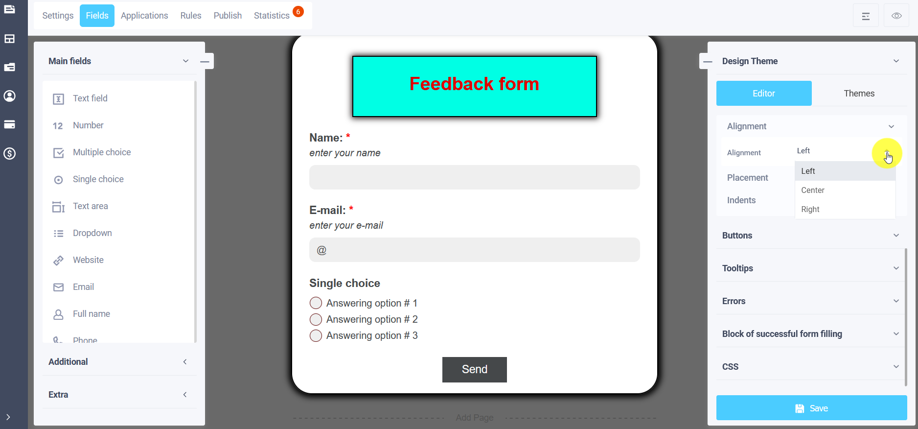
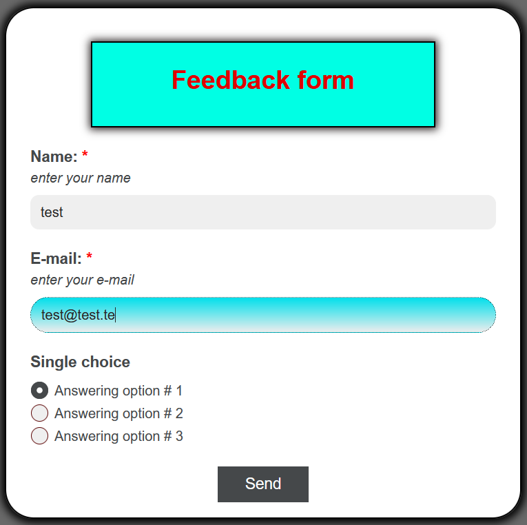
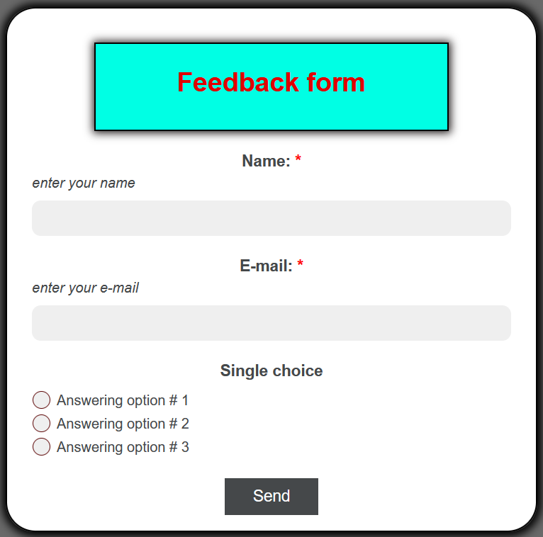
In form view mode, element names are centered:
Placement
You can choose the placement of the element fields at the bottom and on the right by selecting the "Position" item in the theme editing menu:
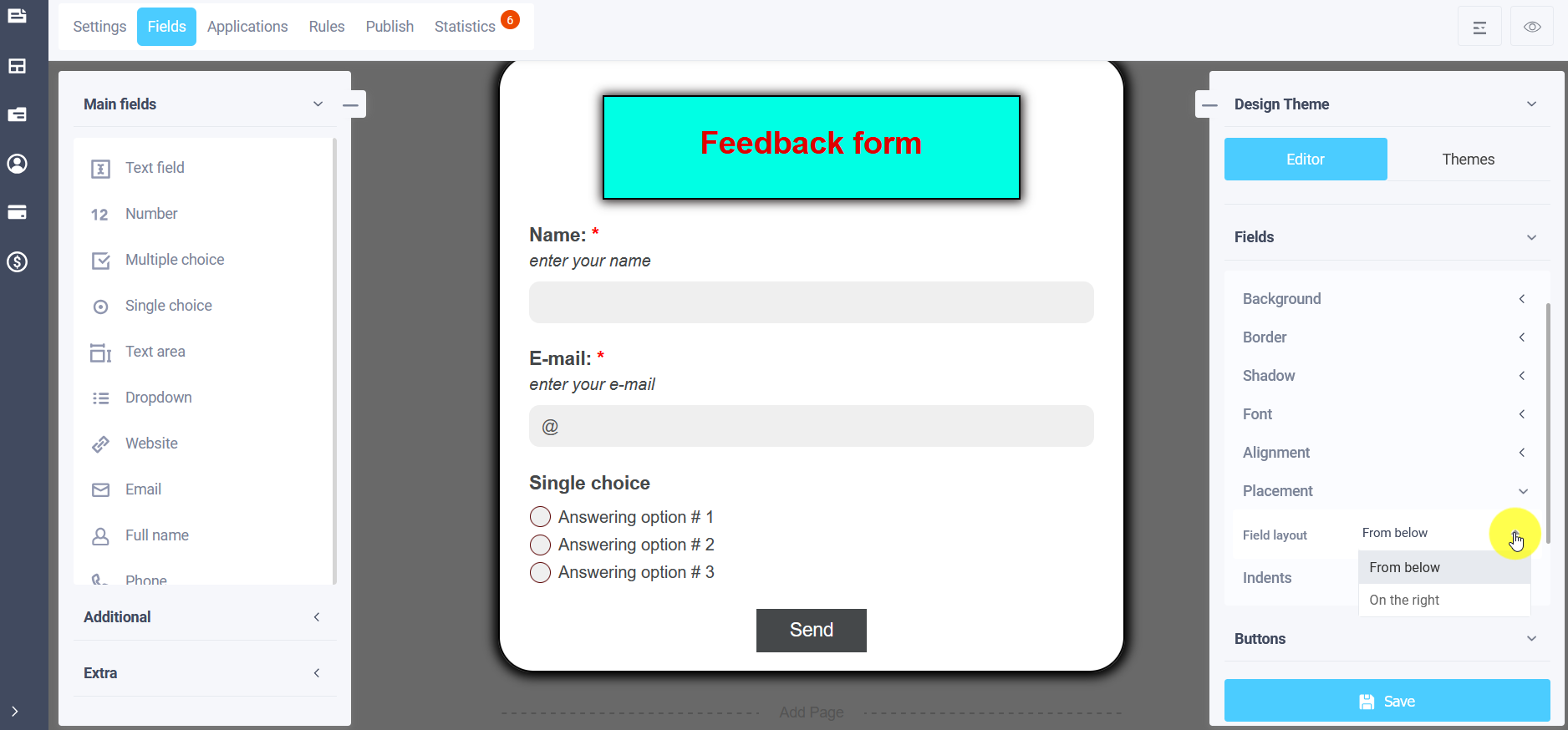
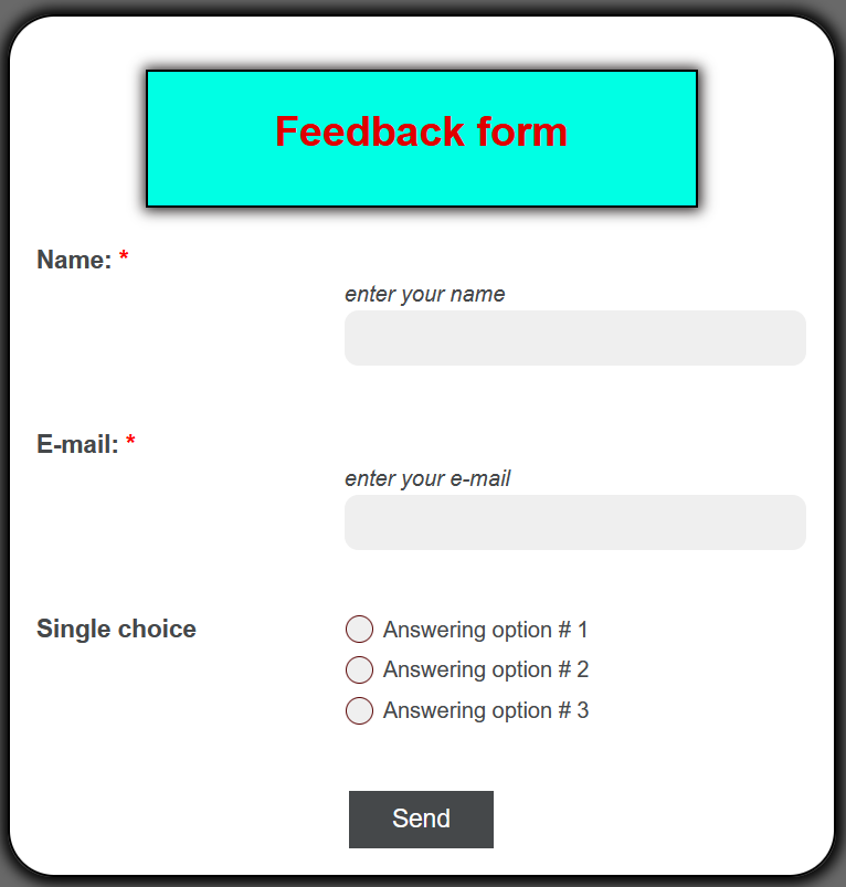
By default, the field layout is "Bottom", if you select "Right", the elements will be located to the right of the element name:
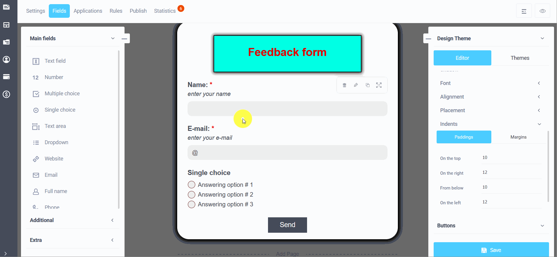
Indents
To enter the "Indents" settings in the form theme editing mode, click on the "Indents" subsection and you will be able to configure the internal and external indents of the form elements: