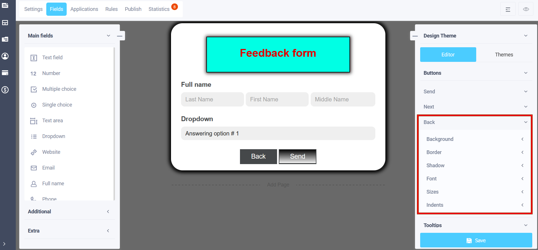
To enter the theme editing mode, you first need to copy the theme (described here - "How to change the design theme?" ). Next, select the "Buttons" item, where you can select the "Send" button, the "Next" button (Forward) and the "Back" button. The following settings are available for the "Send" button:
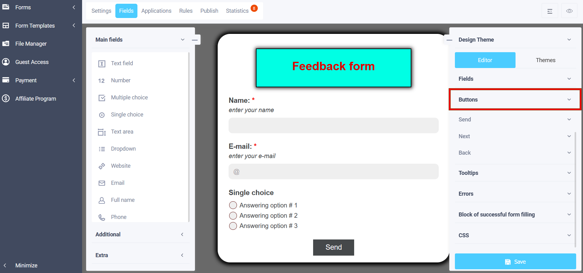
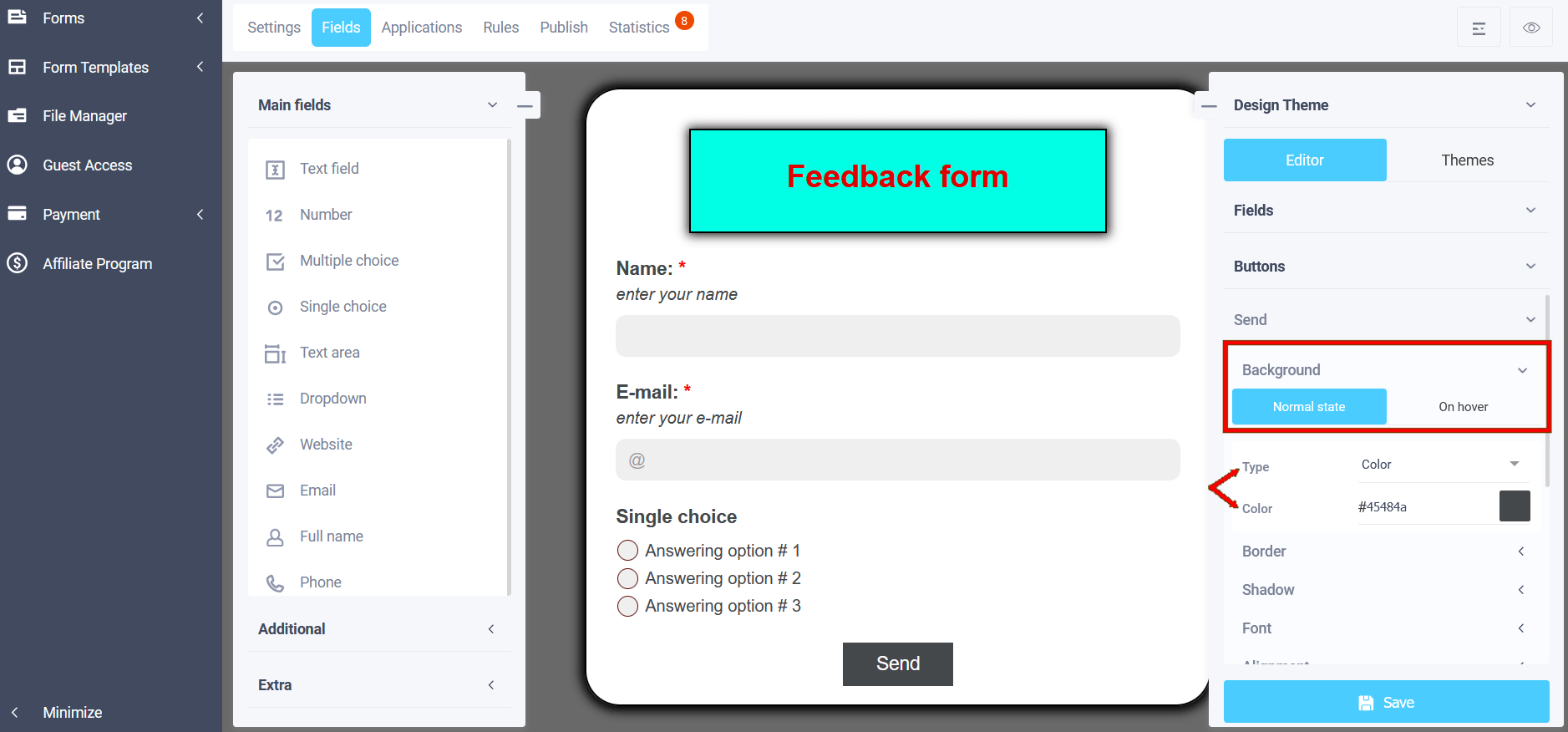
Background
In the "Background" menu you can select a suitable background option for form elements:
- Color
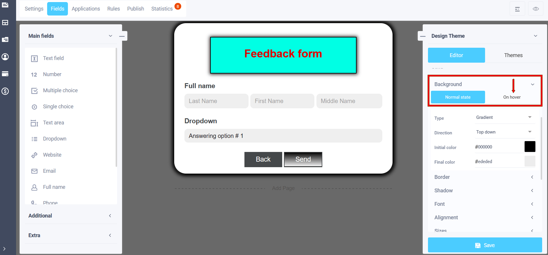
- Gradient
- Image
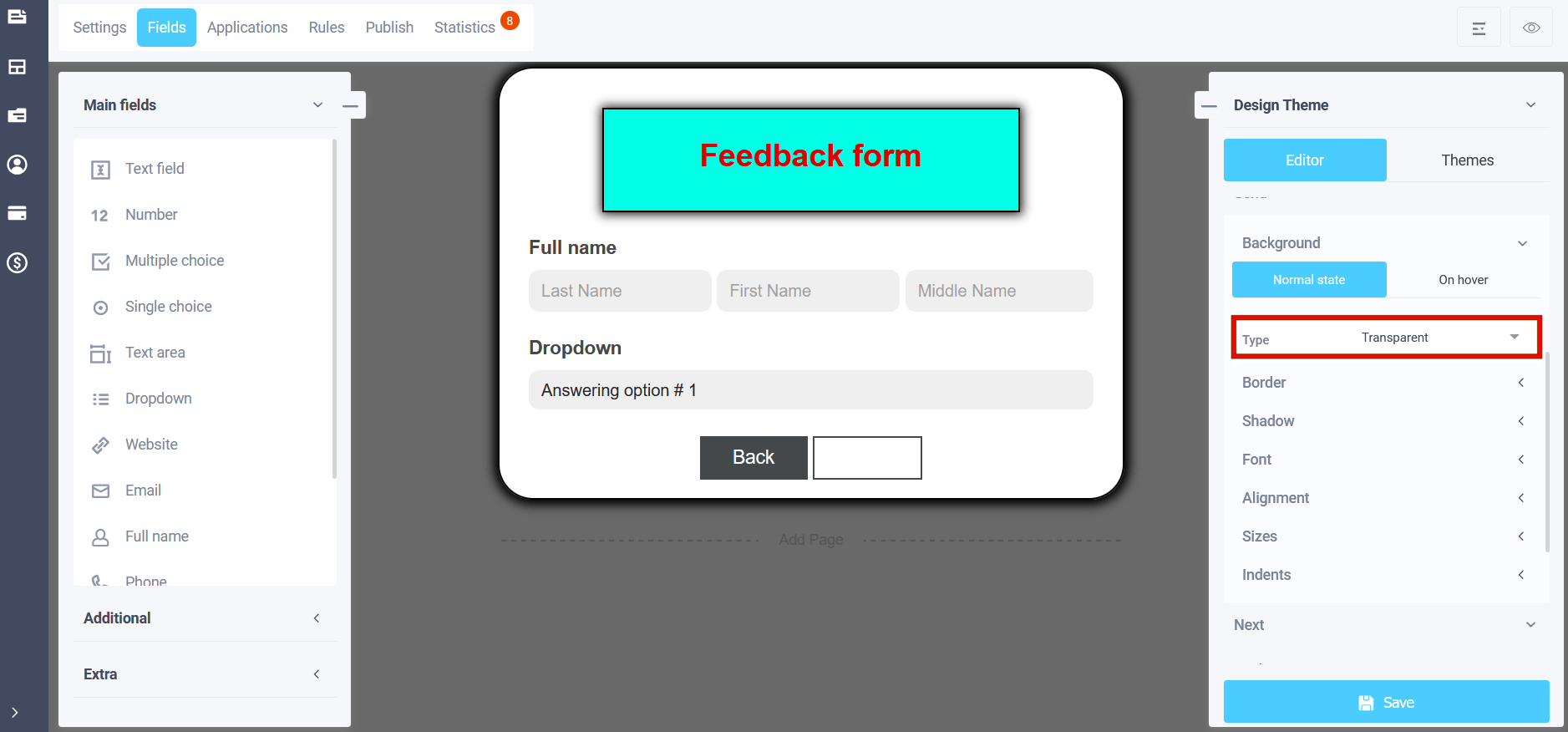
- Transparent
If you select the "Color" item in the main state, a single-color background color for the buttons will be set; you can select a suitable color from the palette:
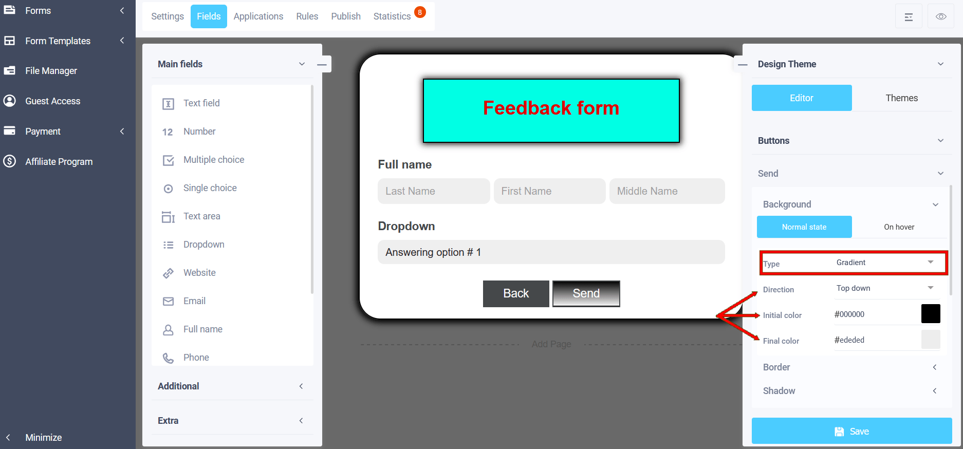
In the "Gradient" item, you can select the initial background color of the buttons, which will transition to the final color, its selection is also available. You can also set the direction of the color transition:
- Top down
- Bottom up
- From left to right
- From right to left
- From top left to bottom right
- From bottom left to top right
- From top right to bottom left
- From bottom right to top left
The next item is "Image". To add an image to the page, click on the "Select image" icon in the "Image URL" field and a pop-up file manager window will open with options for selecting an image:
- Gallery
- Photobank
- My images
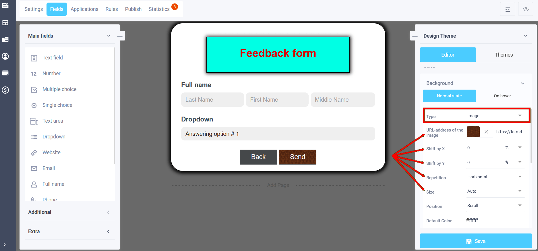
In the "Gallery" section - standard images and in the "My images" section you will have access to previously uploaded images and you can add new images.
In the "Repeat" field, you can set how the image will be located in the element: no repetition, horizontal, vertical, multiply. If you select a transparent background, then the background color of the form will be:
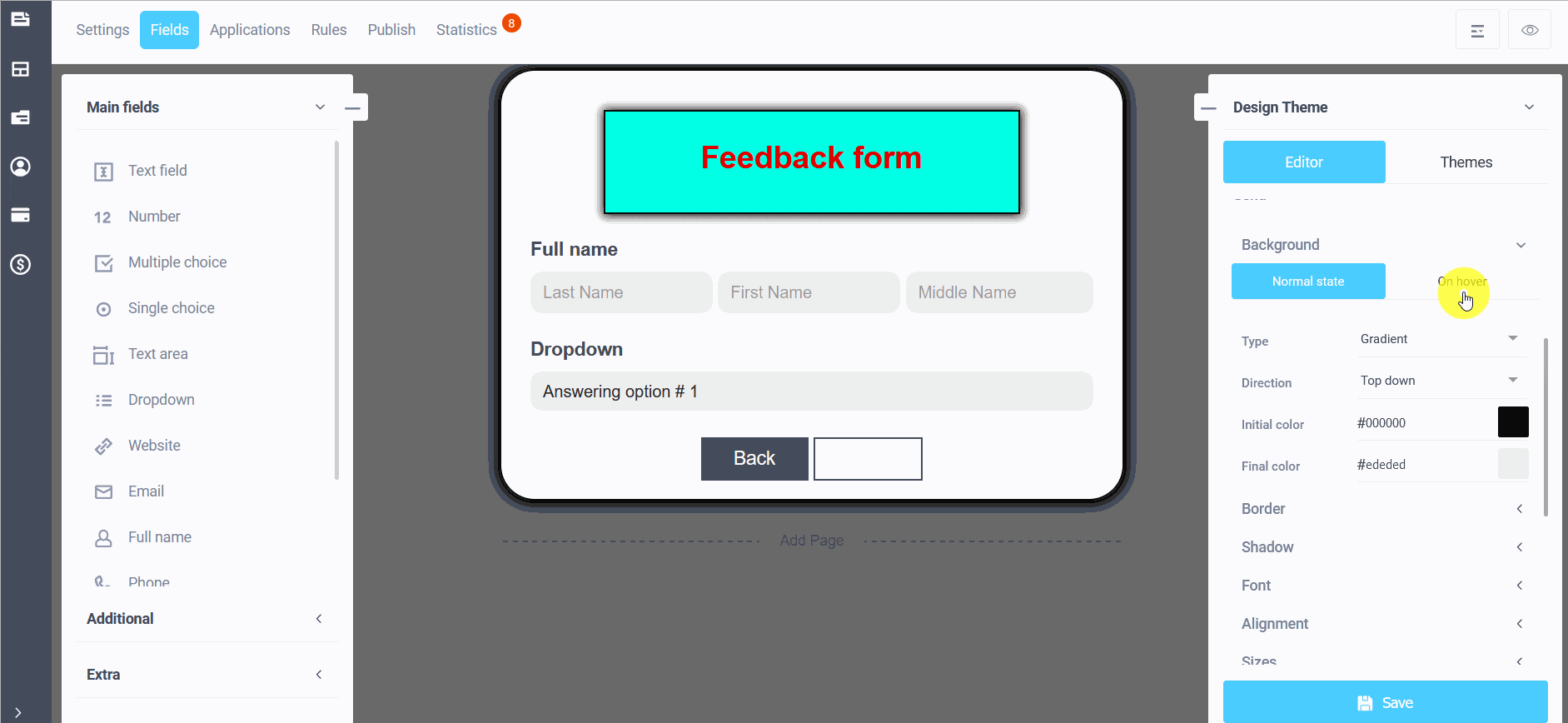
There is also a setting "On hover", i.e. the button background, when the user hovers over the button, its background will change to the specified one. The settings are similar to the normal state:
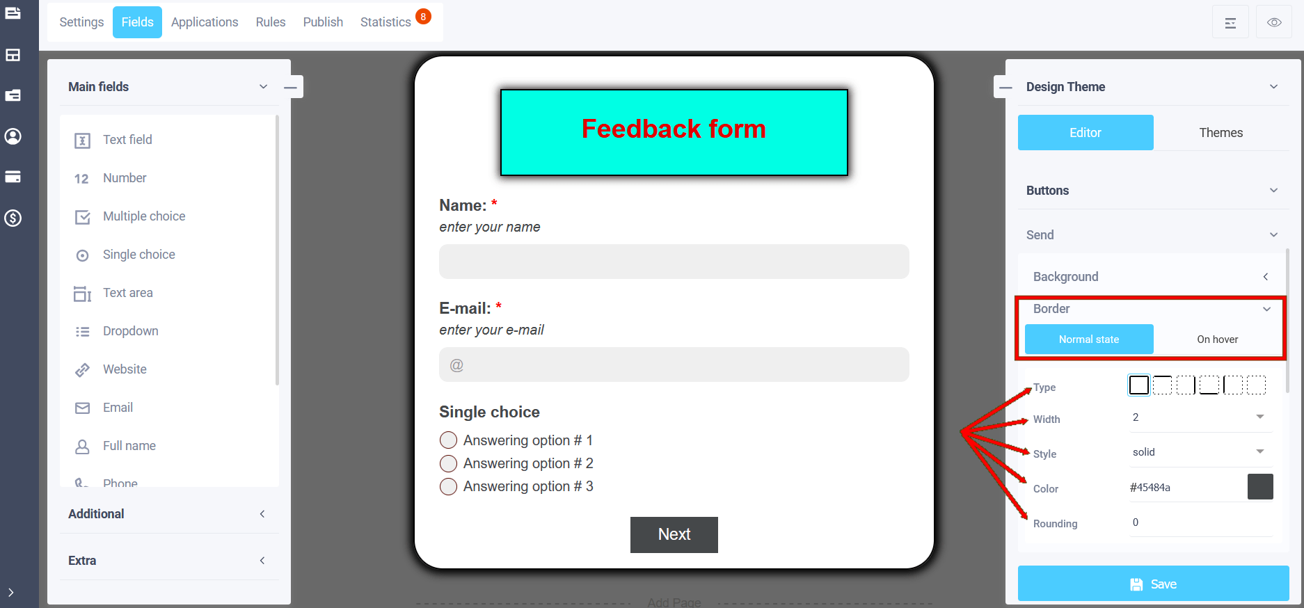
Border
In the theme editing menu, using the "Border" item in the main state, you can set:
- Border type
- Border width
- Border style
- Border color
- Border rounding
To enter the border settings, click on the slider to enable the option and select the sub-item for configuration:
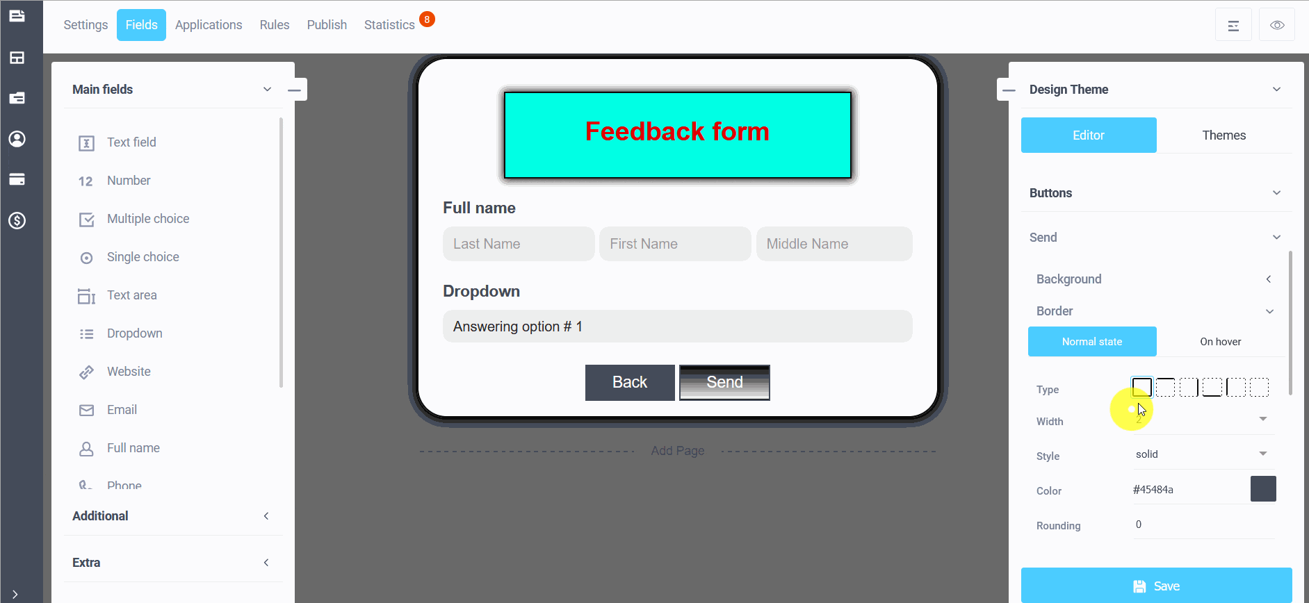
In the normal state, i.e. the appearance of the button border before pressing. For example, we chose a width of 3, a black color and a style of "solid":
And in the "On hover" sub-item, you can also set similar parameters for the border background, which will be visible when you hover over the button.
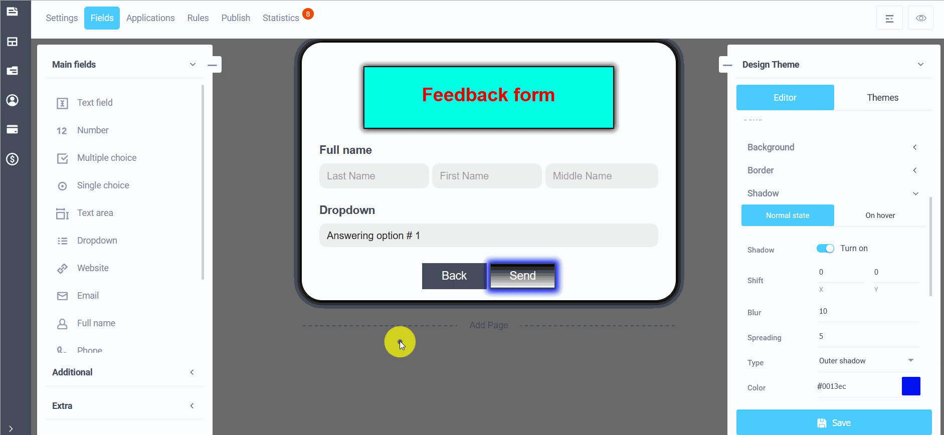
Shadow
In the menu for editing your design theme, you can customize the shadow of the button. To do this, enable the "Shadow" sub-item by moving the slider:
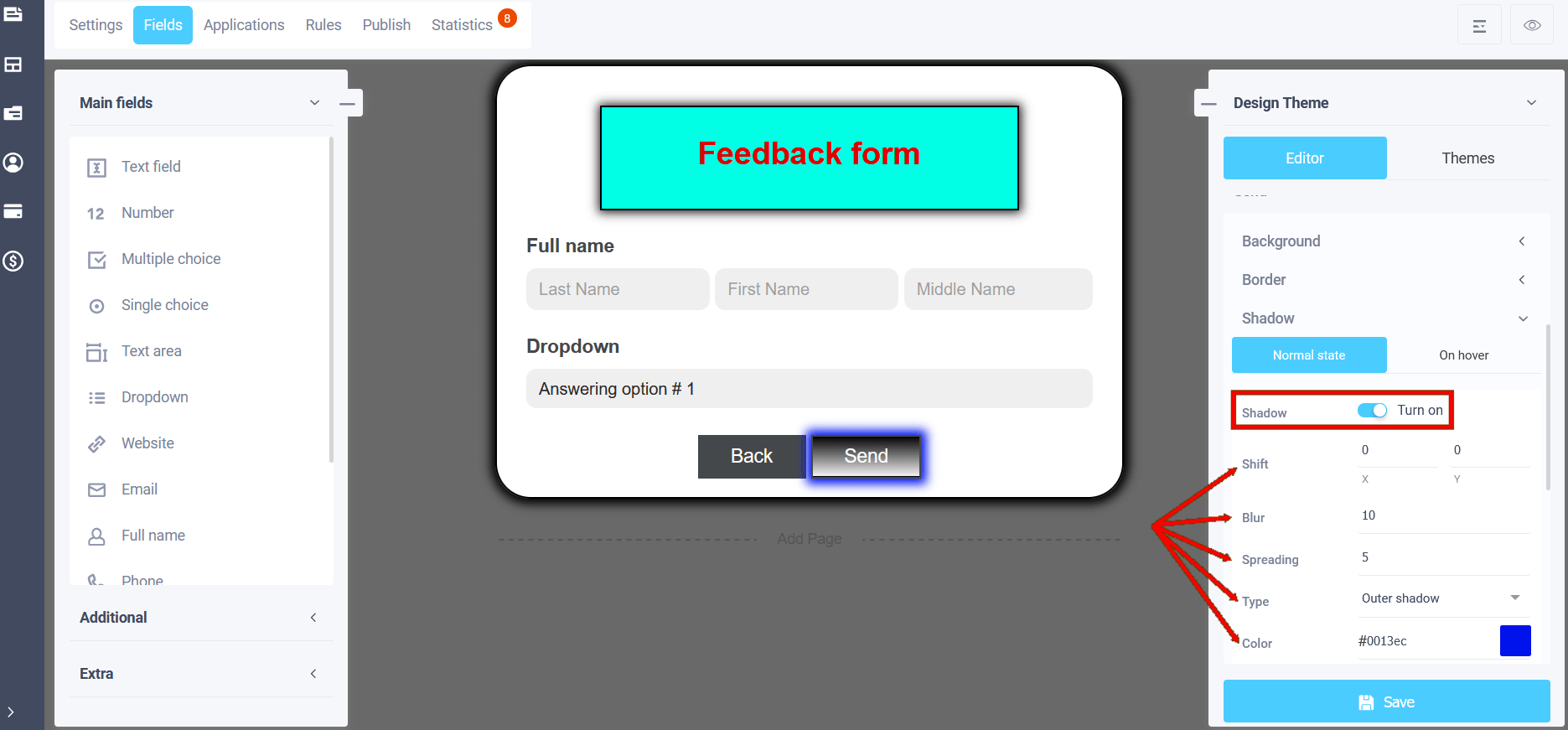
In the shadow settings, the normal state and hover settings will be available, where you can edit: shadow type (outer and inner), color, shadow blur, shadow stretch, transparency and X and Y offsets:
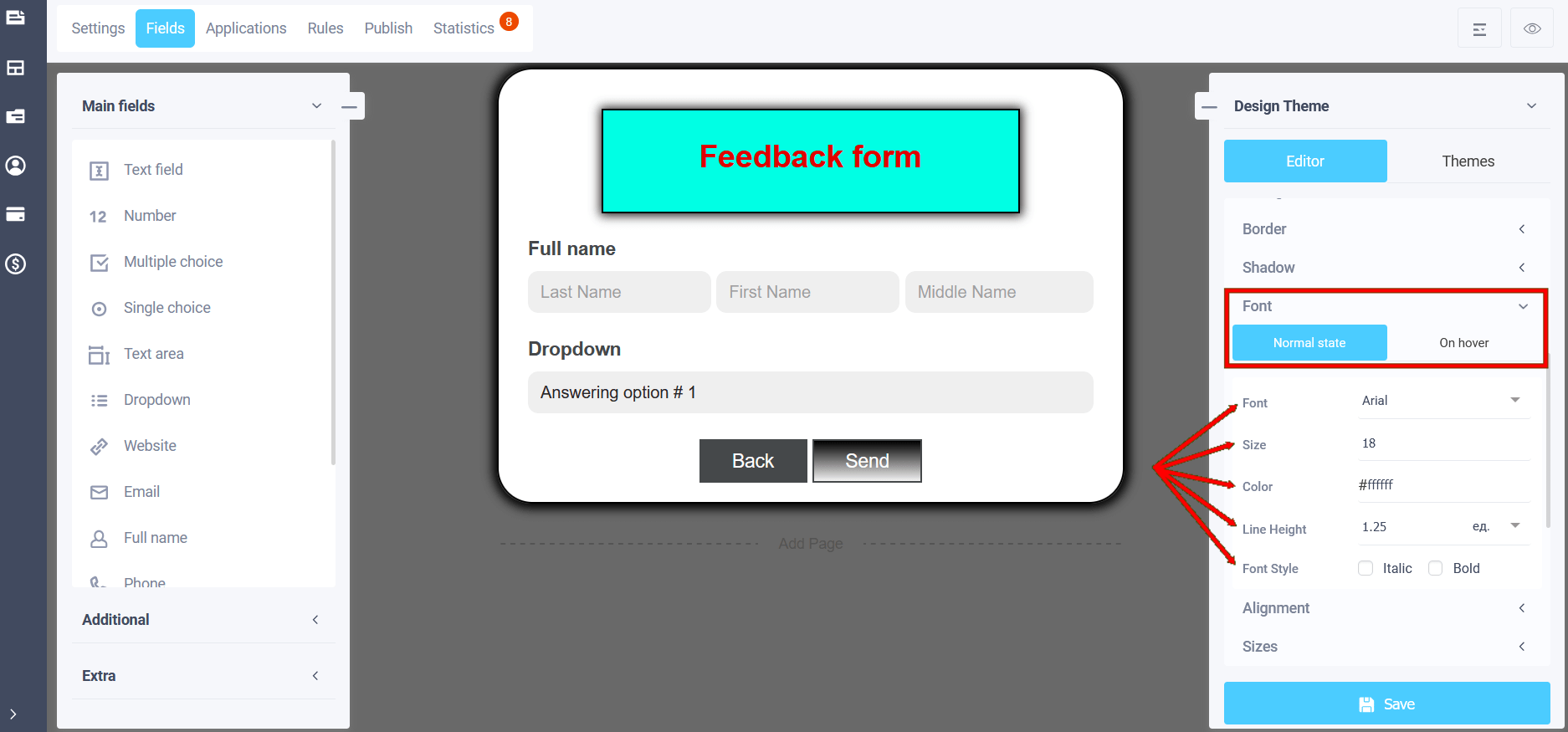
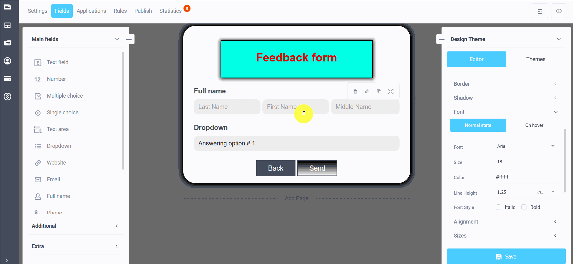
Font
In the theme editing menu, in the "Font" section, subsections are available in the normal state and on hover:
- Font (you can choose the font type)
- Size
- Color
- Line Height
- Font style (italic or bold)
In the "On hover" subsection, you can also configure the analog font parameters of the button:
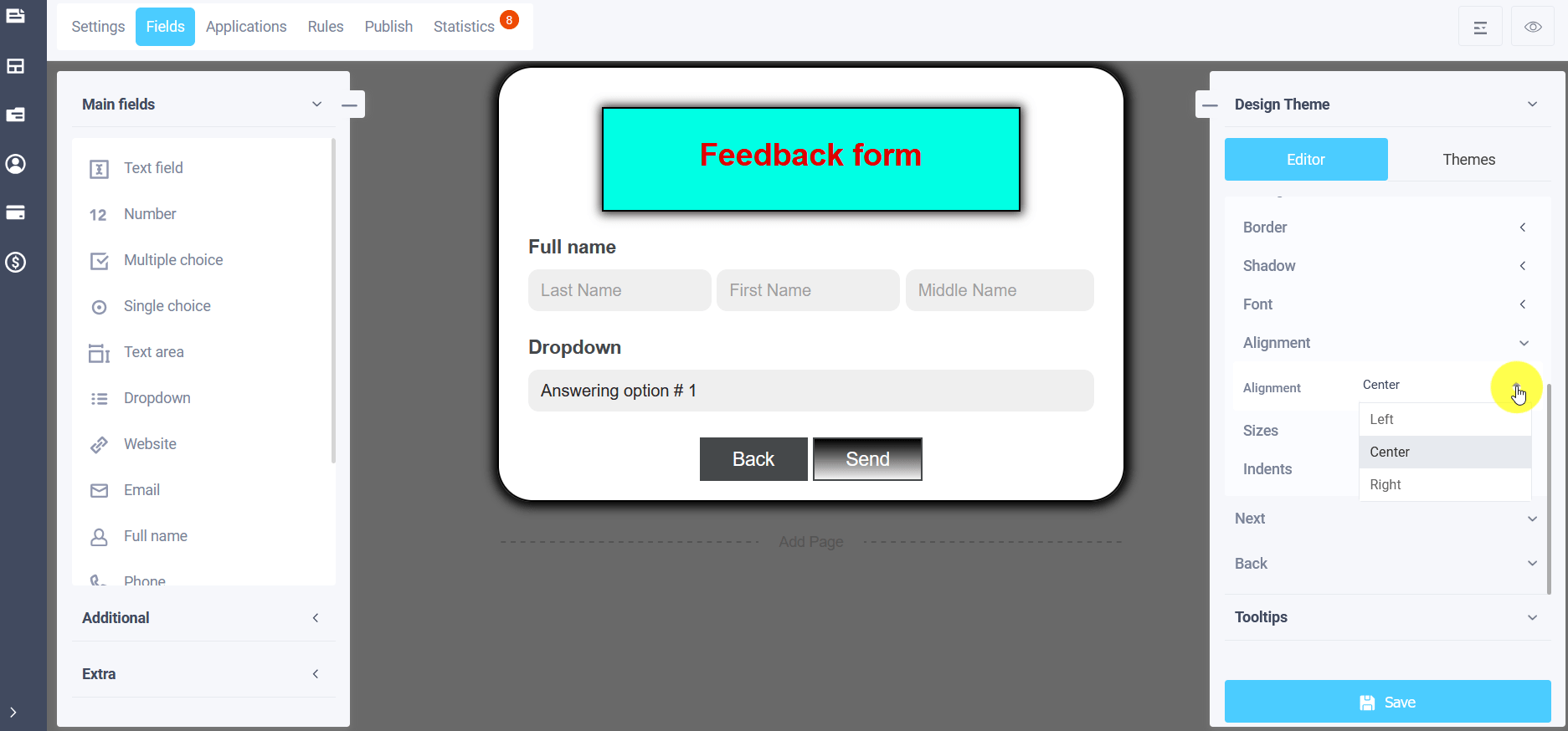
Alignment
In the "Alignment" subsection, you can adjust the button's position:
- In the center
- Left aligned
- Right aligned
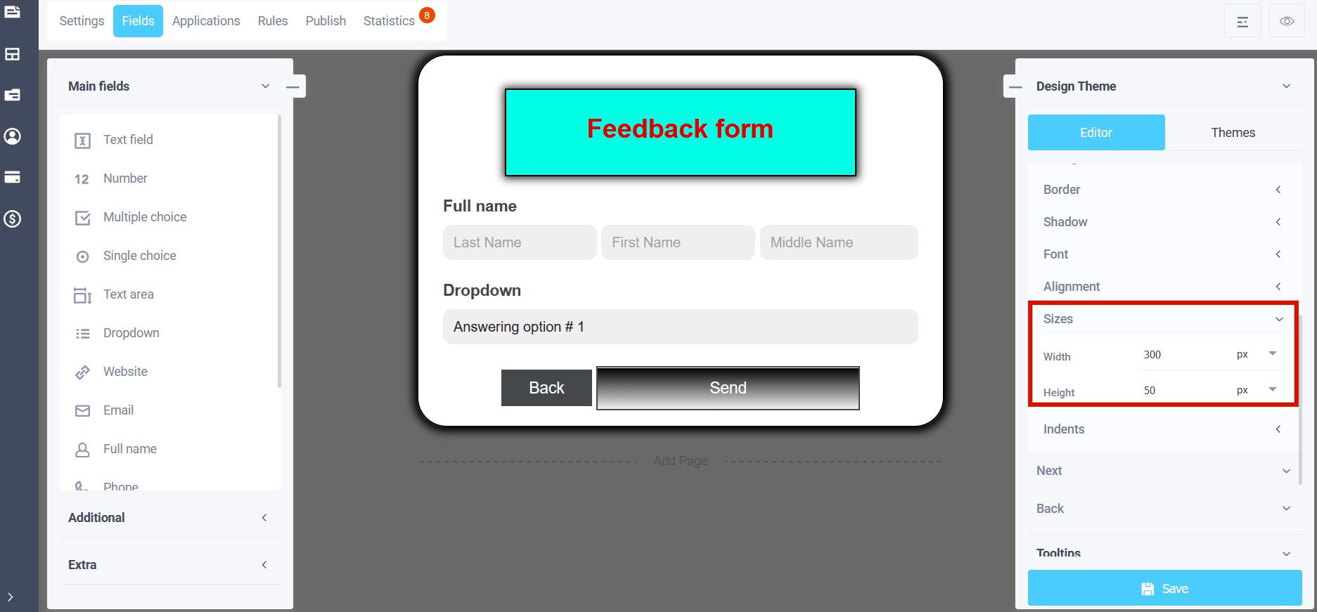
Sizes
In the "Sizes" subsection, you can set the width and height of the buttons in pixels or percentages:
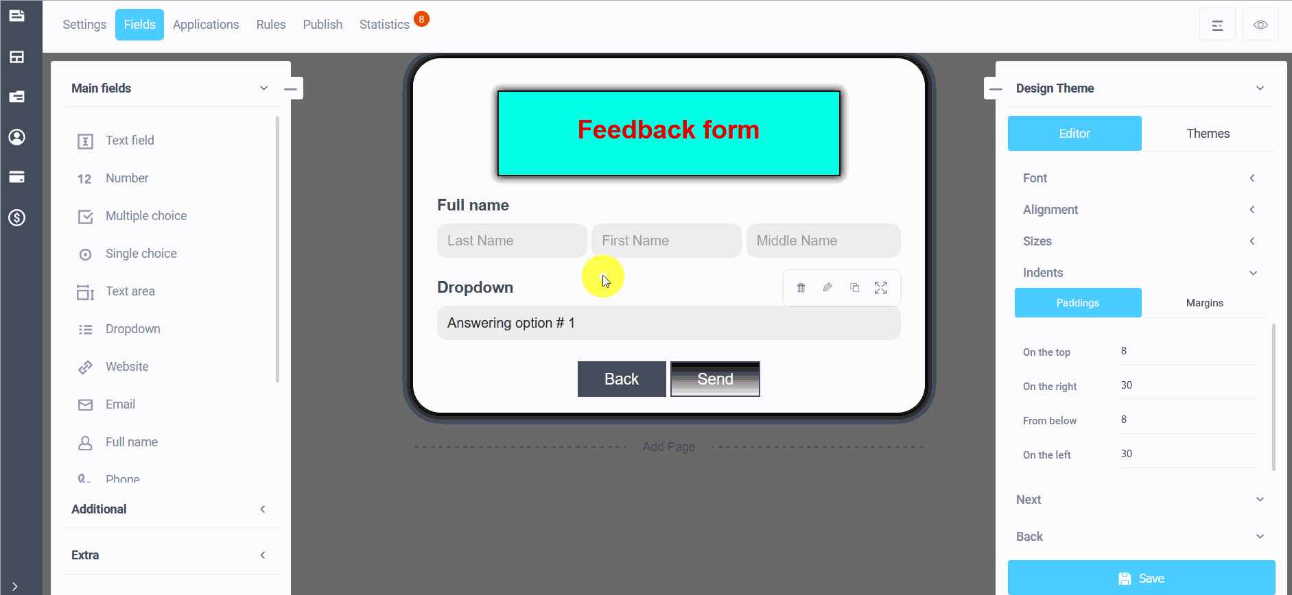
Indents
To enter the "Indents" settings in the form theme editing mode, click on the "Indents" subsection and you will be able to configure the internal and external indents of the form buttons:
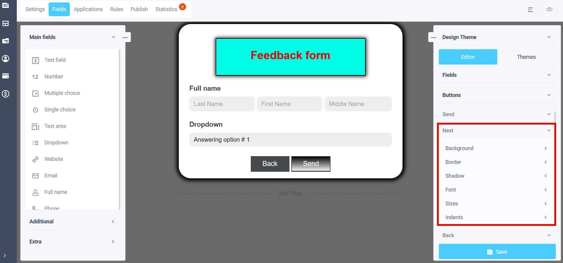
Similar settings for the "Next" button:
And for the "Back" button: