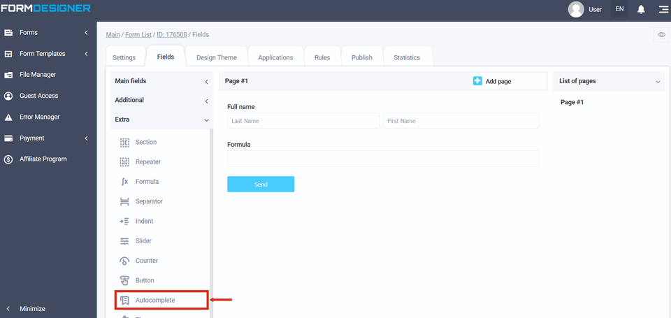
The extra "Autocomplete" element of the form is somewhat similar to the "Drop-down list" form element, but it supports a much larger number of response options. The main difference from the drop-down list is that the "Autocomplete" form element helps the user choose the necessary answer option, offering suitable options for the first characters typed by him. To add the "Autocomplete" element to the form, you need to click on the selected item or drag it to the right, then you will see the added element on the right:
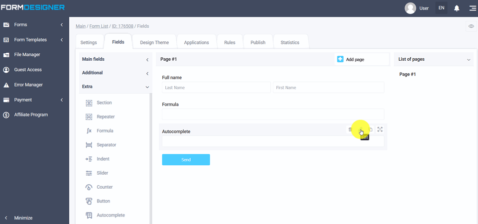
After you have added the "Autocomplete" element, click on the "Edit" icon and a pop-up window for editing this element will open in front of you:
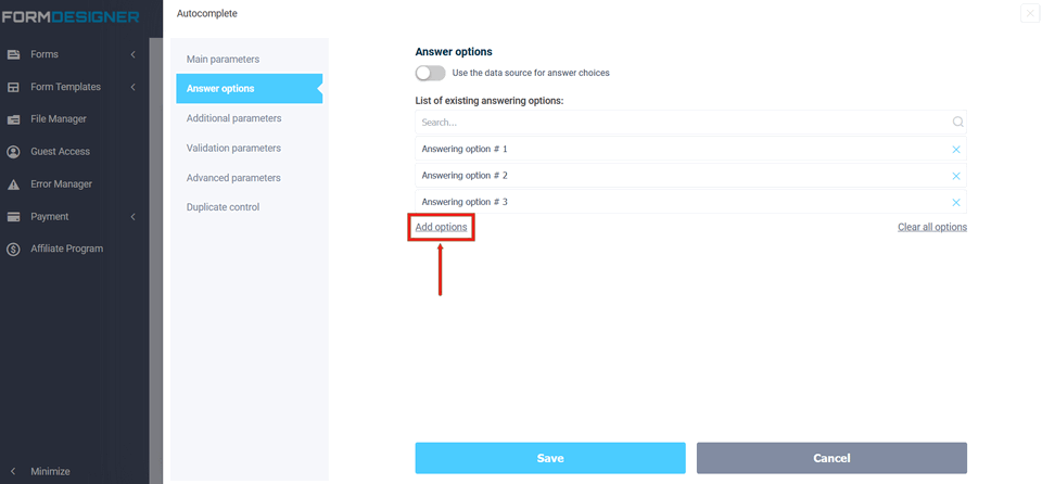
In edit mode, you can configure options for the "Autocomplete" element, to do this, open the "Field Settings":
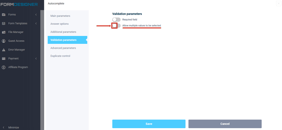
To make it possible to select multiple options, enable the option in the "Allow multiple values to be selected" field:
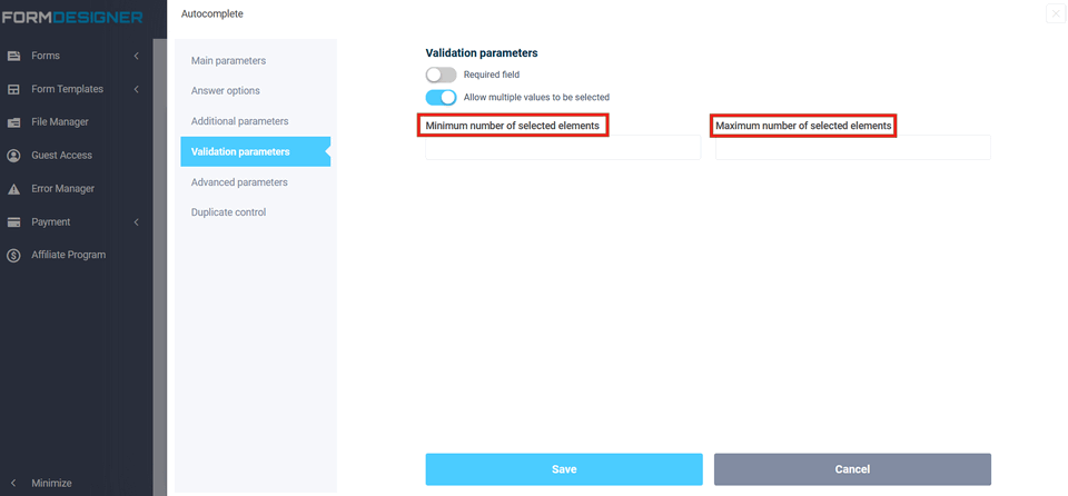
When the "Allow multiple values to be selected" option is enabled, fields with the minimum and maximum number of selected answers are available:
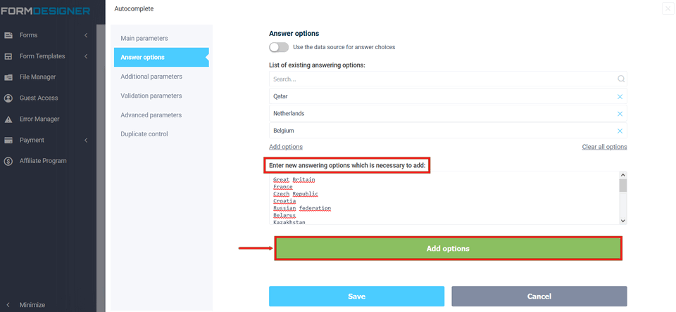
By analogy with the drop-down list, add options:
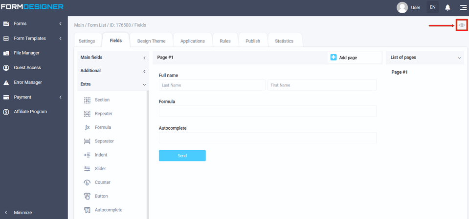
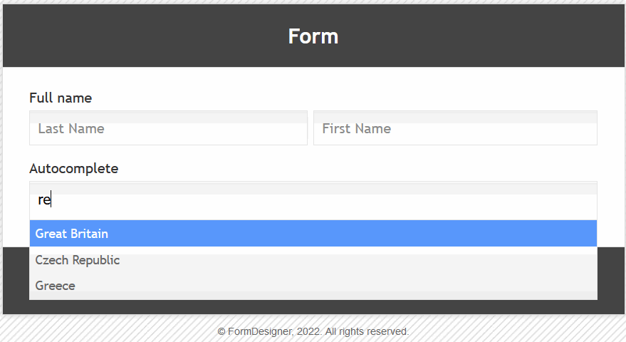
To view an already configured form, click on the "Preview" icon and the form will open in a new tab in your browser:
The value and description of other fields, you can see here "The main parameters of the elements". Now, when you enter at least a couple of letters, options appear, which makes it easier for the user to choose the answer:
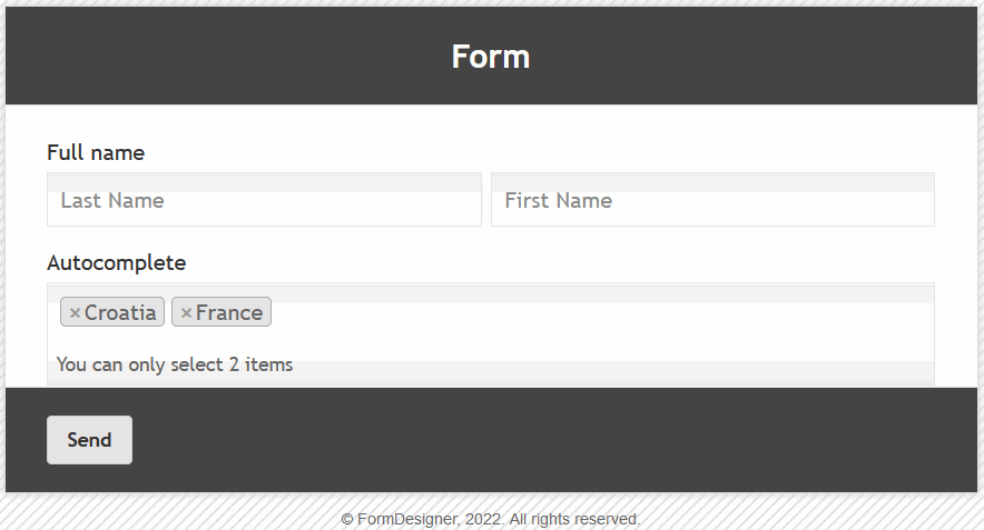
If you select several options, the form will look like this: