Element settings are divided into sections:
- Basic parameters
- Answer options (multiple choice, radio buttons, list, autofill)
- Calculation formula (in the formula element)
- Additional parameters
- Validation parameters
- Advanced parameters
- Duplicate control
Main parameters
The "Name" field - you can specify the text in it, and you can also disable the display of the name in this field when you click "Do not display the name of the form". The floating header is used in the "Title" field, i.e. there will be text, but when entering data in the form, it will move to a different position, for example, above this field:
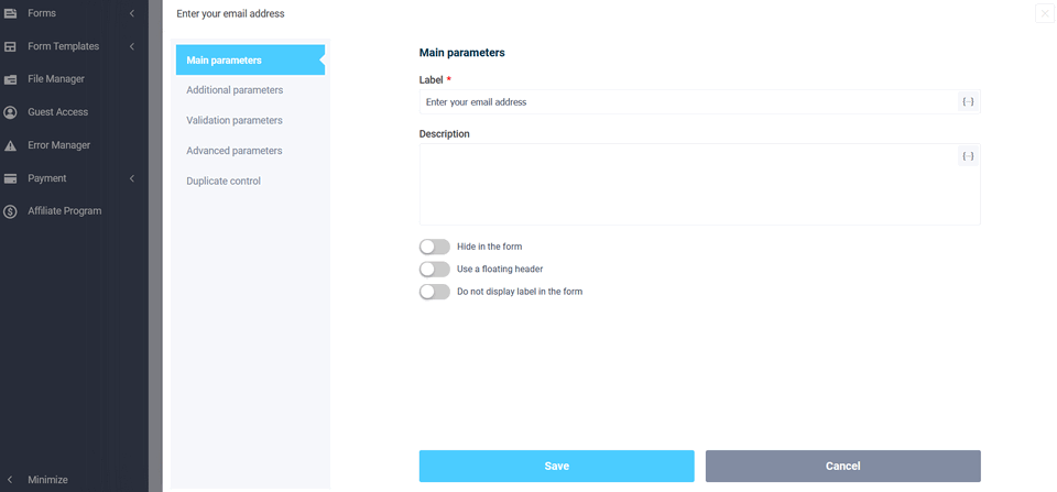
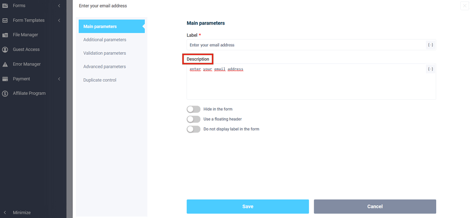
The next "Description" field - the text entered in this field will be displayed in italics above the "Name" field (can be used as a hint for this field). If a checkbox is enabled under the previous "use floating header" field, then the "Description" field will be unavailable:
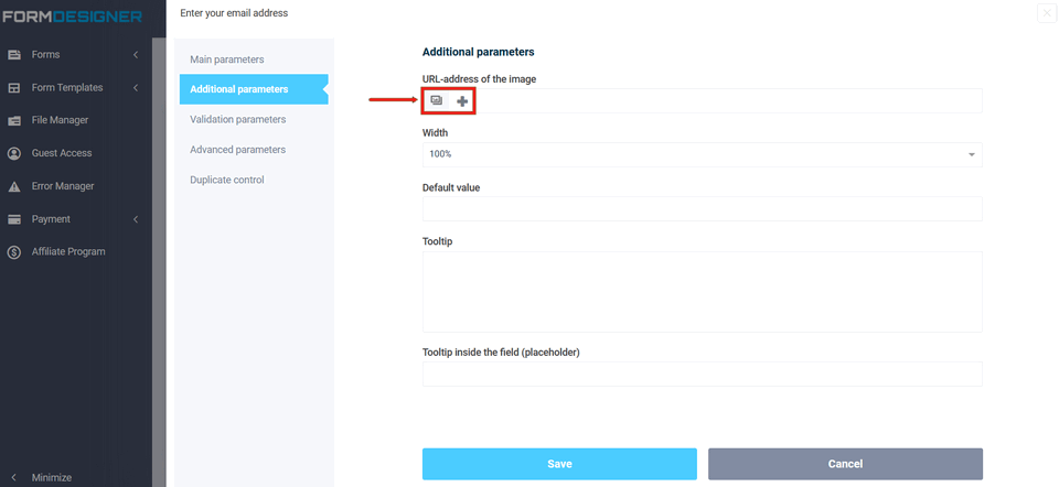
Additional parameters
In the "image URL" field, you can specify the location of the image for the form:
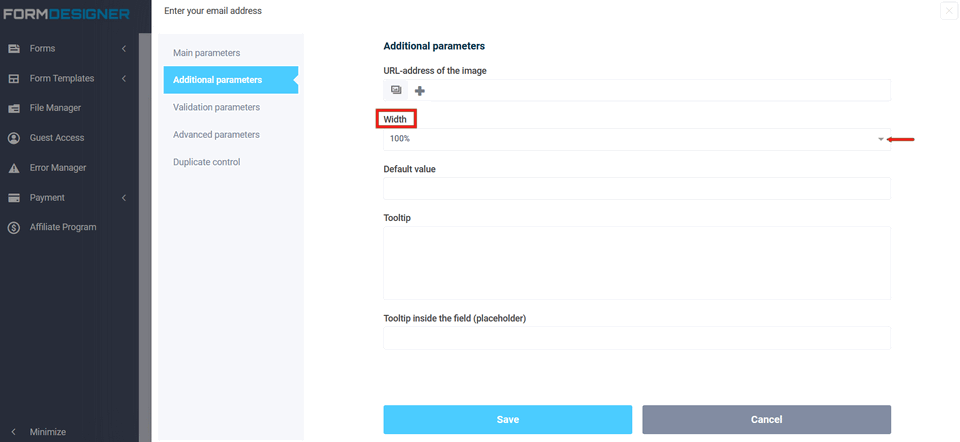
In the "Element Width" field, you can adjust the width of the field as a percentage of the width of the form:
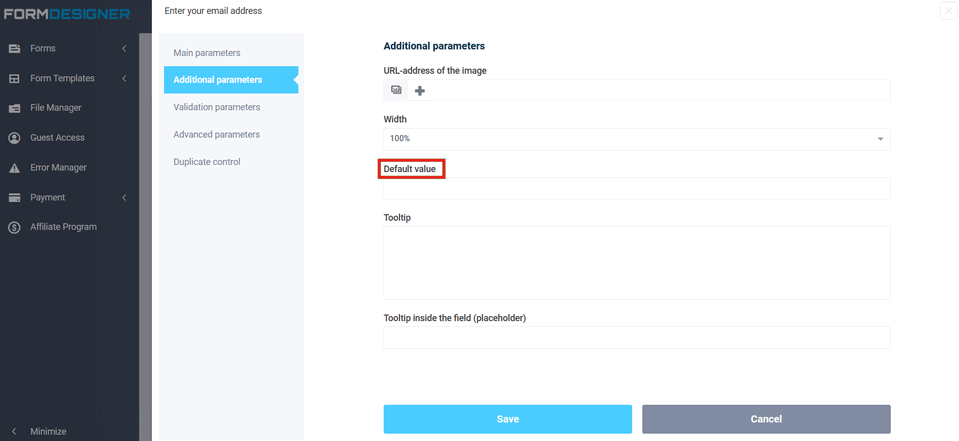
In the next "Default Value" field, there will be a certain text is displayed until the user begins to enter data, while he must delete the default text. In order for the text to be displayed only until the information is entered, a "Hint inside the field (placeholder)" is used for this.
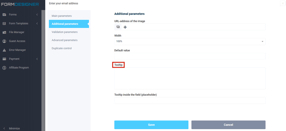
In the "Tooltip" field, you can customize the information when you hover the cursor over this field (it is also possible to change the appearance type of hint: to do this, go to the "Design Theme" tab. Click "Hints" on the left):
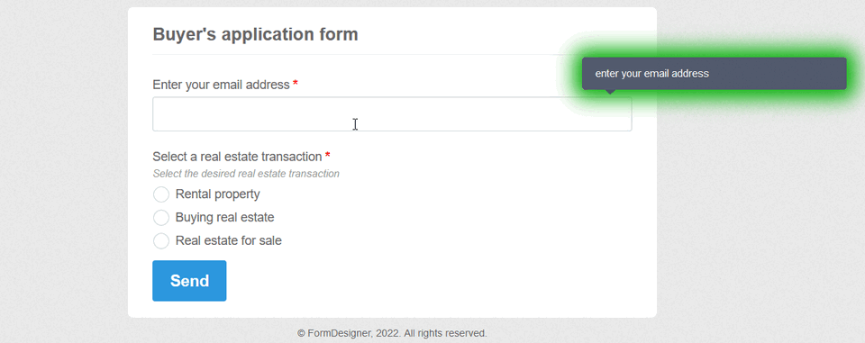
The field "Hint inside the field (placeholder)" displays information in the field, when entering data into this field, the hint is removed:

Validation parameters
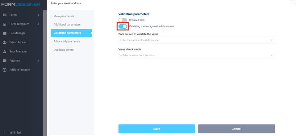
The "Validation Parameters" field - in this field, you can specify the required fields of the form or specify that only certain types of data should be entered in certain fields (for example, only letters or only numbers; entering an email address; entering a url, etc.). Validation rules ensure that the form is filled in correctly by the site visitor. By enabling this option, fields marked as mandatory, fields for entering email and URL addresses, as well as fields for entering numbers, will be validated before sending the form to the server. When you use multi-page forms, the user will not be able to go to the next page until he fills in all the fields correctly (if "online form validation" is enabled in the form settings):

If you activate the option "Checking the value by data source"
After that, two additional fields will appear below, where you need to select the data source itself, which will be used to search for values and the verification mode:
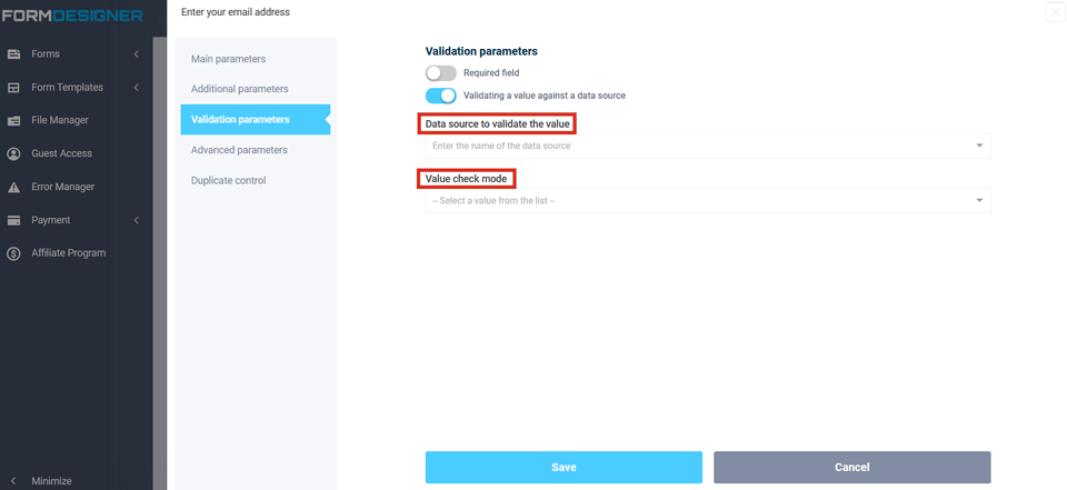
You can create a database in a Google spreadsheet or through another FormDesigner web form, where, for example, you can enter a list of email addresses, phone numbers or promo codes.
Next, you can configure the verification of the values entered by the user for this database and, depending on the verification mode, output one or another error.
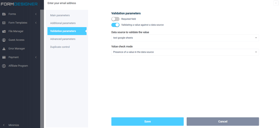
If you have selected the check mode for the value "Presence in the data source" and the user enters a value that is not contained in this data source, an error will be displayed stating that such a value was not found.
If you select the check mode "Absence in the data source", then on the contrary, the user needs to enter a value that is not yet contained in this data source.
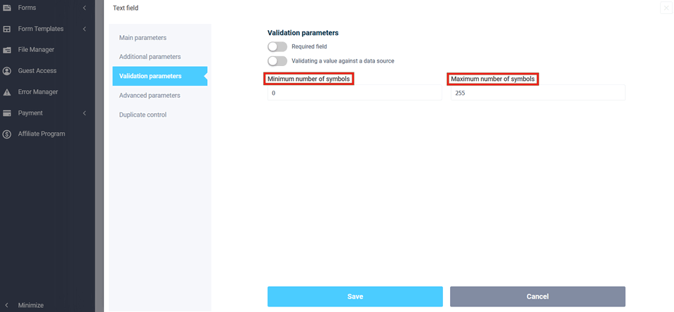
The "Minimum number of characters" field specifies the minimum number
of characters at which the form will be processed, and the "Maximum
number of characters" field specifies the maximum number of characters:
Advanced options
The "CSS class name" field is needed for configuration via CSS, i.e. we have registered
the class name for the element, and then in the design theme it is for this
element that you can configure the necessary CSS styles:
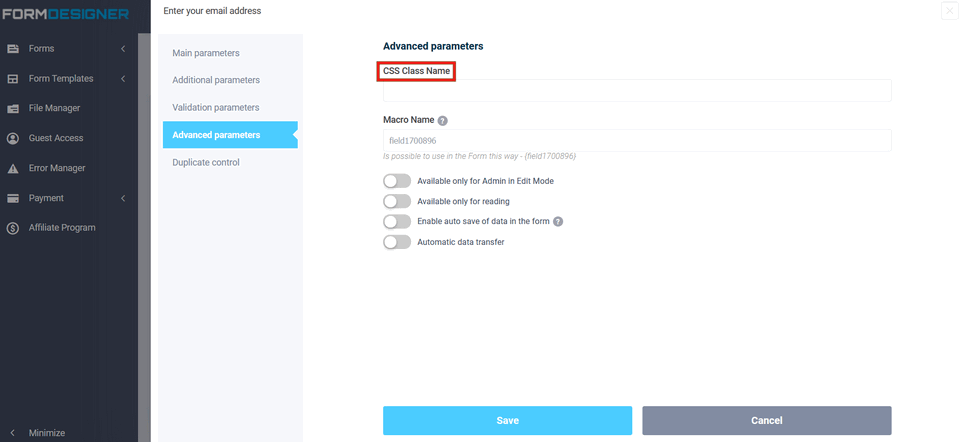
You can see an example of using the "CSS Class Name" field here.
An arbitrary name is very convenient to use to quickly add a macro in the text, in the notification template, etc., as well as when copying the form, the macro will be saved. You can instead set up a macro of the form {field012345}, for example, in the "Email" element, specify the value {email} and it will work, both for substituting values into the form, and for processing macros directly in the form, and it will work with auto-save. I.e., you can register in different forms the same macro name, and when filling out the form, this value will be saved immediately for all forms where there is such a macro. For example, for a username, this can be used. In one form, the user entered his name and then, in all subsequent forms, his name will already be substituted in the field.

If the switch "Available only for admin in edit mode" is activated in the element, then the field will be available only for admin in edit mode, for the user this field will not be displayed in the form at all, i.e. it will be inactive.

If the "Read-only" switch is activated in the element, then it will be impossible to enter data or select an answer option in the element. It is very convenient when setting up logical rules, and by automatically setting values in fields, it is necessary to make it possible to prohibit editing the value in this field.

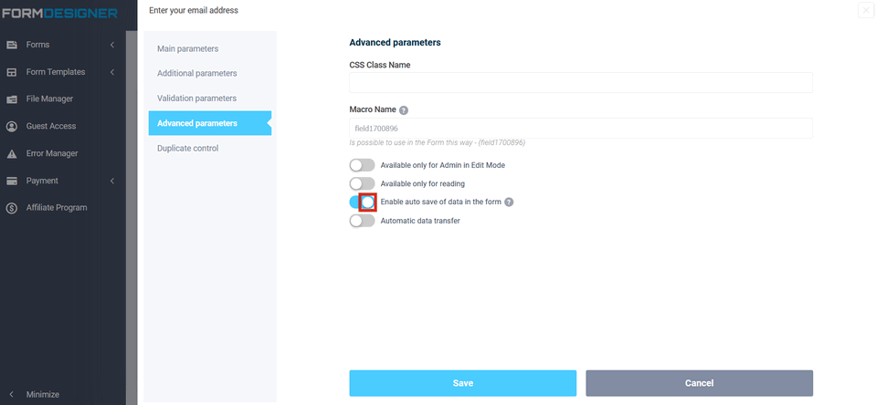
The option "Enable auto-saving of data in the form" allows you to save the data entered by the user and when you visit the page with the form again, this data will be automatically inserted into the form:
I.e. it is possible to prescribe in different forms the same macro name, and when filling out the form, this value will be saved immediately for all forms where there is such a macro. For example, for a username, this can be used. In one form, the user entered his name and then, in all subsequent forms, his name will already be substituted in the field.
Using the "Automatic data transfer" option, you can configure the automatic transfer of data from the URL or cookies to the desired field of the web form, and for this you do not need to change the form code on the site. After activating the option, two fields "Parameter names from URL" and "Parameter name from Cookie" will be displayed:
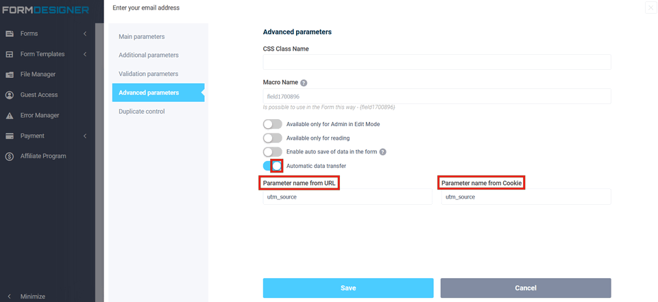
You can learn about the functionality of automatic data transmission in this article.
Duplicate control
If the "Duplicate control" option is activated, the form cannot be sent twice with the same data.
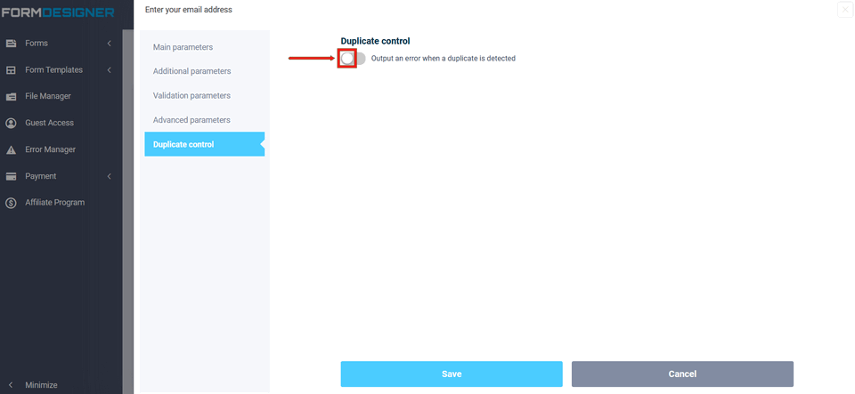
For example, if for an email or phone form element, enable this checkbox, then the user will not be able to send 2 times web form with the same email address or phone number.