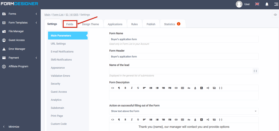
After you have created the form, go to the "Fields" tab:
Groups of elements of your form will open in front of you:
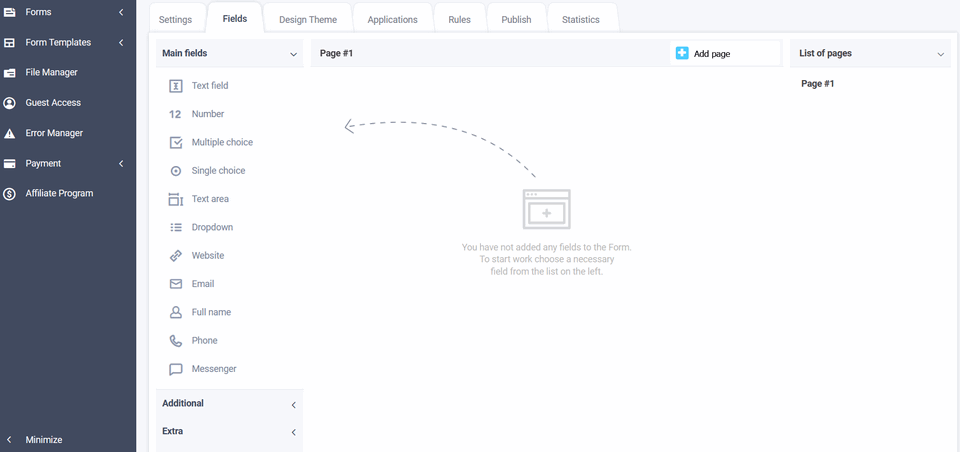
Main fields
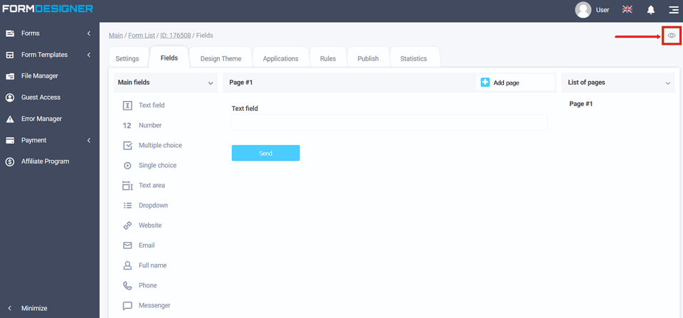
The following fields are currently available in the "Main Fields" settings:
- text field
- number
- multiple choice
- single choise
- text area
- dropdown
- website
- full name
- phone
- messenger
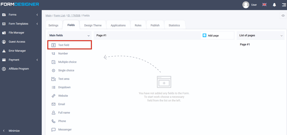
To add any field, you need to click on the selected field or drag to the right, and then you will see the added field on the right:
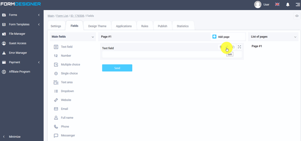
You can go to the settings of the added field by clicking the "Edit" icon:
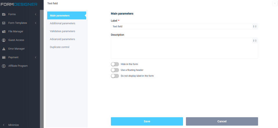
This opens a pop-up window with the field settings:
The meaning and description of the fields, you can see here "Basic parameters of elements".
For example, the "Text Field" field is used to enter a single line of text. The "Name" field - you can specify the text in it, and you can also disable the display of the name in this field when you click on the "Do not display label in the form" item. In the section "Additional parameters" in the "Default Value" field, there will be a certain text is displayed until the user begins to enter data, while he must delete the default text. In order for the text to be displayed only until the information is entered, the "Tooltip inside the field (placeholder)" is used for this.
To view how the form will look, click on the "View" icon:


Additional fields
- Date
- Input mask
- File upload
- Html block
- Social media buttons
- Password
- Hidden field
- YouTube Video
- Image
- Star rating
- Question Matrix
