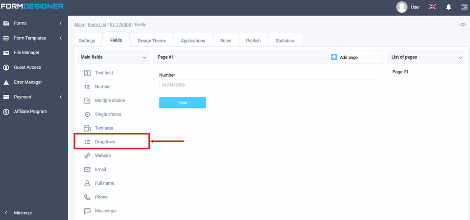
The "Dropdown" element is used to present the user with a list of different options. The functions of the "Dropdown element are similar to the functions of the "Single choice" element, but they make it possible to save space for the form. The "Dropdown" element can be configured so that one or several values can be selected. Such an element is often used as a drop-down menu in site navigation, city selection, country selection. To add the "Dropdown" element to the form, open the elements, click on the "Dropdown" item in the "Main fields" group of elements, or drag to the right:
You will see a standard view of the "Dropdown" element with three options:
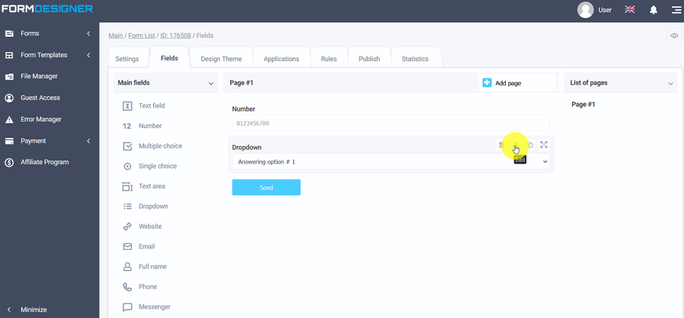
To make changes to an element, click "Edit" and a window with the settings of the "Dropdown" element will open in front of you:
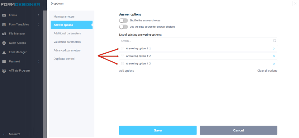
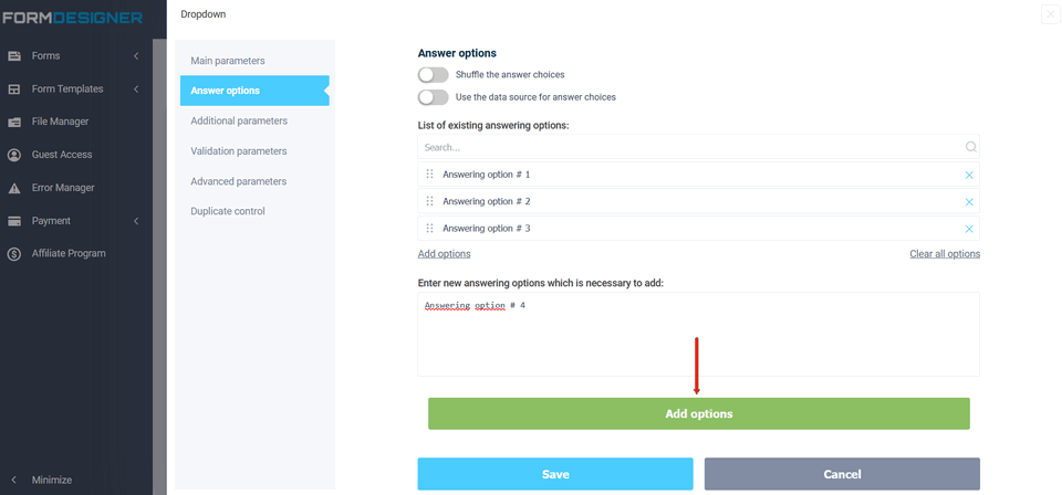
In the "Answer Options" field, click anywhere so that you can edit the names in the "Dropdown" element, as well as add other answer options:
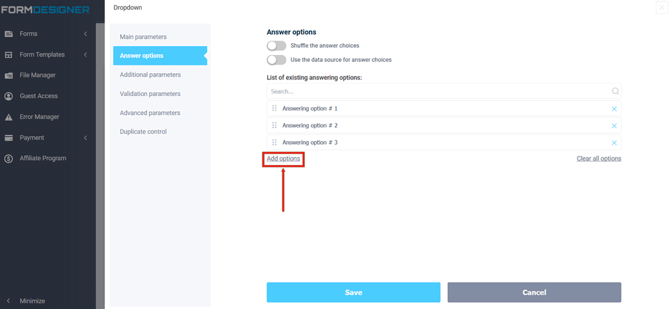
After you have added new answer options, click the "Add options" and "Save" buttons:
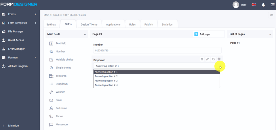
Now you can see your options in the list:
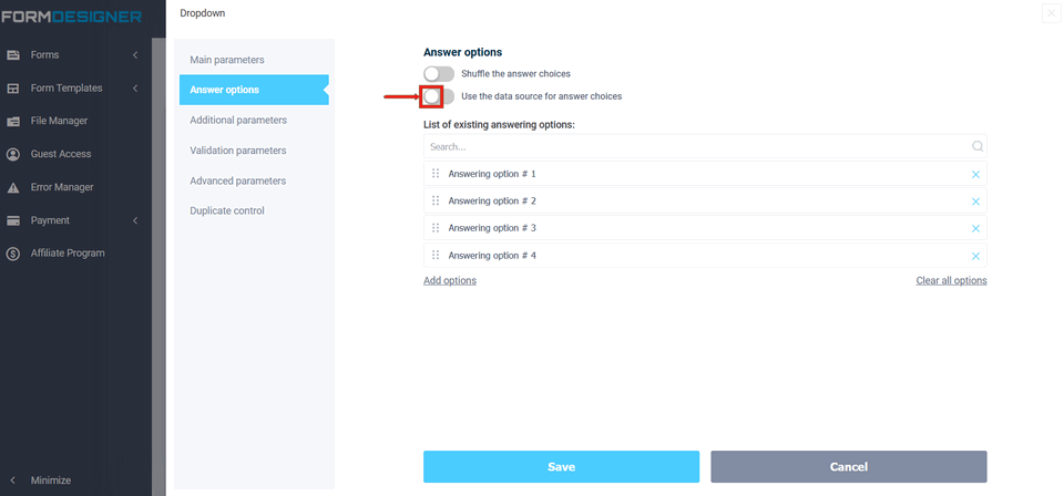
You can also use data sources as answer options. In order to add a data source, you need to activate the switch:
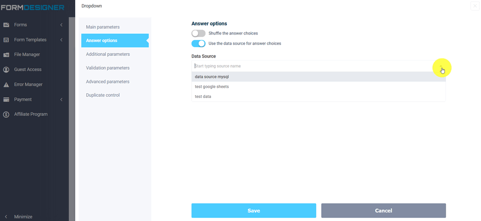
In the "Data source" list, select the desired source:
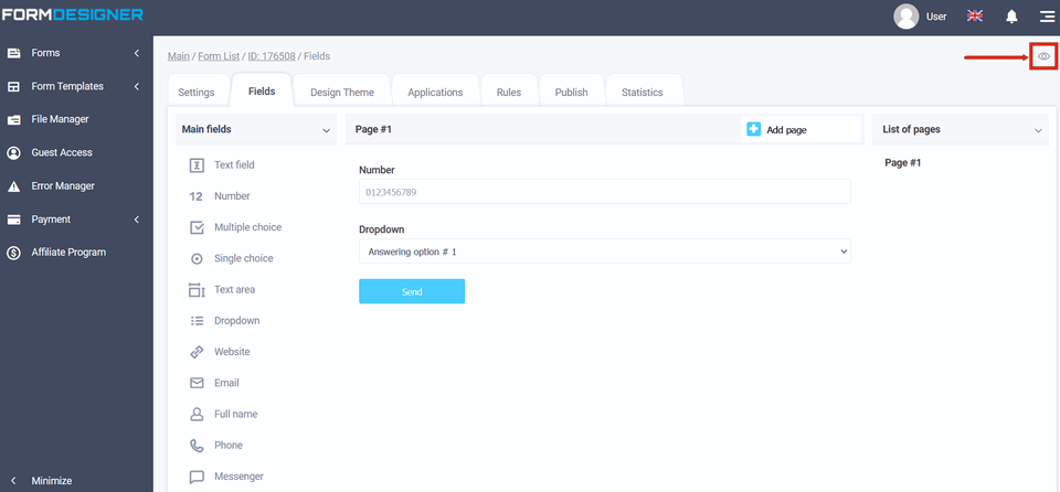
To see how the form will look in the browser, click on the "View Mode" icon:
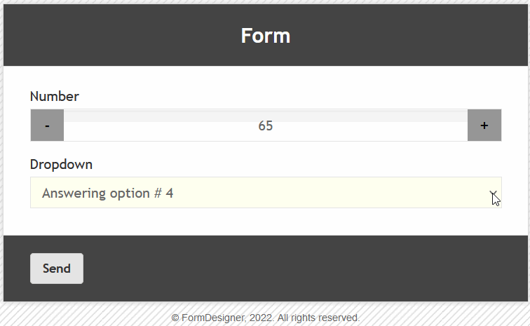
In the new browser page, you will see a form with a dropdown with the specified answer options:
The value and description of other fields, you can see here " The main parameters of the elements".